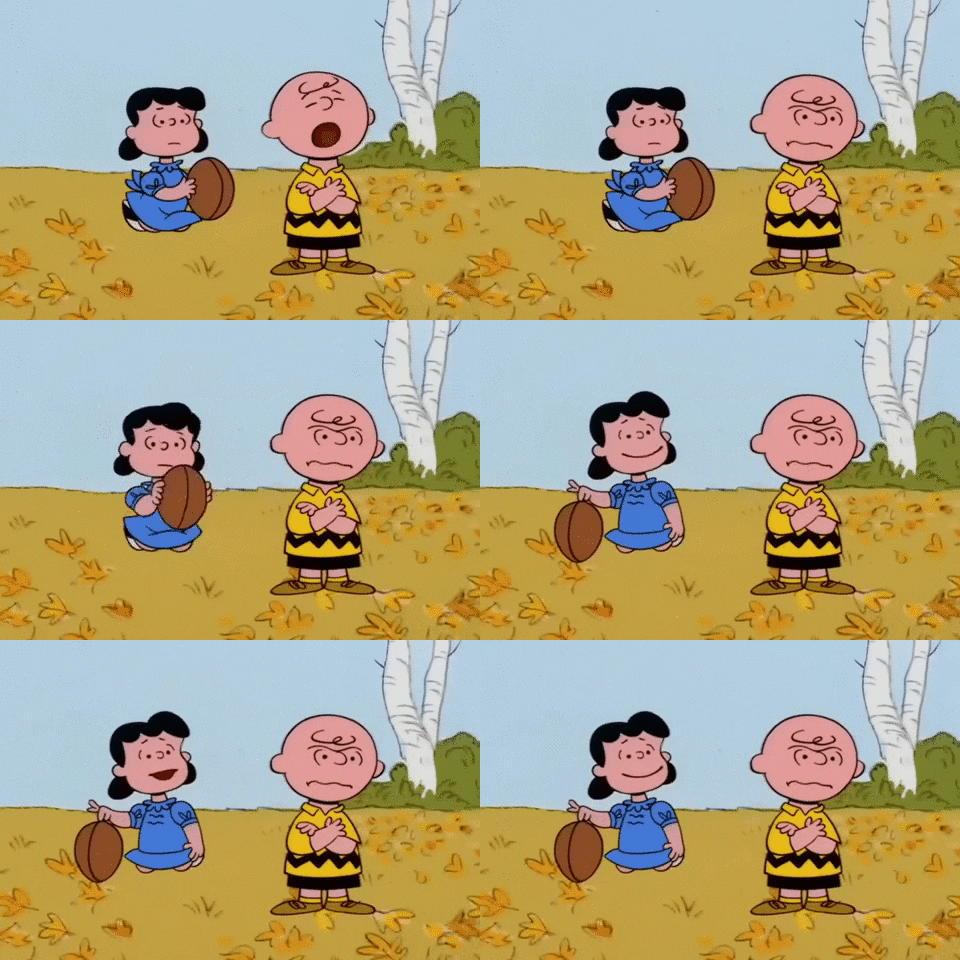
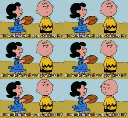
When it comes to Draft Day Sports: College Football, this is how I feel, I think.
I was one of Brooks Piggott’s original testers and players of Pro Football Simulator, way back in 2012. (For the rest of this piece, I’ll refer to Brooks by his first name.) The game was marketed towards the online market; in this fashion, Brooks was ahead of his time.
Of course, time catches up with you. When Brooks joined Wolverine Studios and began to expand the game towards a broader audience (the offline market), there were some glaring holes. But of course there were; Brooks is a solo developer. He is also very responsive to his audience, and clearly very dedicated. He has been given a long leash by rational gamers, the same kind that has been afforded Markus Heinsohn, Arlie Rahn, Jim Gindin, Adam Ryland, and Brooks’ colleague and founder of Wolverine Studios, Gary Gorski.
(Author’s Note: I am absolutely pointing the term “rational gamers” at the irrational, this-game-sucks-because-you-didn’t-fix-the-small-thing-I-wanted crowd. Please note that rational gamers have issues with the games; however, the approach to those issues, and the patience given to those issues because, again, these guys generally run solo, makes them rational. I shouldn’t have to point this out, but have you met society or people?)
My issues with Brooks’ games are well-documented, because I’ve written several reviews of his games. I had major issues with how data and information was presented within the game; namely, tons of dead space on screens that could have been better utilized. I had issues with recruiting, to the point that I actually had to abandon a review.
I can’t say I became irrational; I simply didn’t play the game. It wasn’t for me. But, compared to 2012 me, the one filled with so much hope and idealism that we’d get something deprived of us since Joe Stallings ran off with Total Pro Football…well, compared to that guy, I was Randy Quaid in Major League 2.
That brings us to now. Well, “now” is relative; I’m writing this section on August 16th. Wolverine’s First Look video for Draft Day Sports: College Football 25 released on August 12th. I watched skimmed through it, and saw some things that are intriguing. It may have something to do with EA releasing their first college football game in a decade. It may have something to do with us inching closer to my sim fantasy since 2000, that being a universe that houses baseball, football, basketball, and hockey leagues under one roof (that has expanded to include soccer, tennis maybe, golf maybe, and pro wrestling).
As I watched skimmed through that video, I thought…maybe this is finally the year Brooks and Wolverine reels me in.
And then I thought this.
(Author’s EA College Football Rant: Thanks mainly to Reddit, but also my cracking Derby County save in FM24, I still haven’t bought EA College Football 25; I have an XBox Series S I got for free from Verizon for getting FIOS a year ago that has never been opened; I fully expected to have opened it and played a ton of College Football by now…but nope. The apparent bare bones feel to Dynasty Mode gave me the ick, as the kids and women say. 24-year-old me does not understand 44-year-old me at all.)
A note before we begin: I began writing this some time ago. Life gets in the way; in this case, getting married, a honeymoon, and several curveballs thrown at my jobs (yes, jobs) caused this to get pushed off the backburner. It is December 20th as I’m writing this; I still have not played EA College Football, though my wife did get it for me for Christmas.
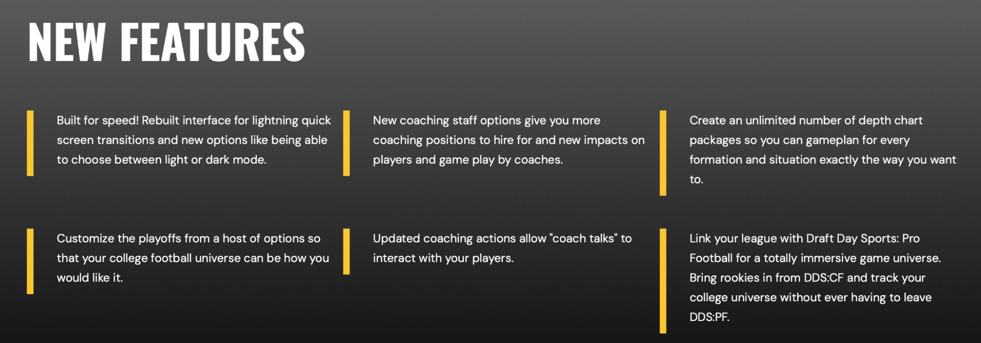
Here are the front-and-center features in DDSCF25, per Wolverine’s website:
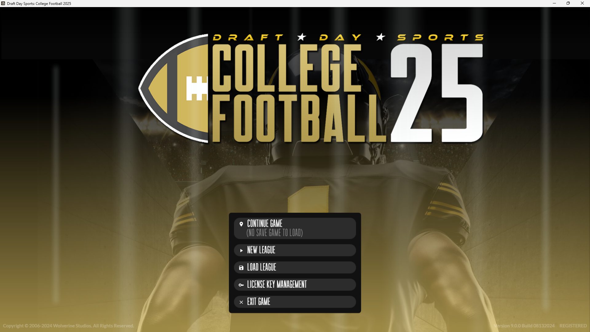
Graphics / Interface
The game has more of a DDSCB/PB feel, with a side menu akin to what you’d find in those games. There are also several buttons along the top, that send you to various other screens.
 I forget those buttons along the top exist. All the time. That’s more a me thing, but I’m so used to looking along the left…they just don’t register to me. If it were me, I’d love to have everything on the left, with expandable menus for the team pages. It would simplify things into one place to look, while keeping things neat. The pages do look neat, things look more organized and sharp.
If I can train my brain into looking at the left being for league stuff, and the top being for things related to my team…that would be easier. Maybe with time, that’ll come to me.
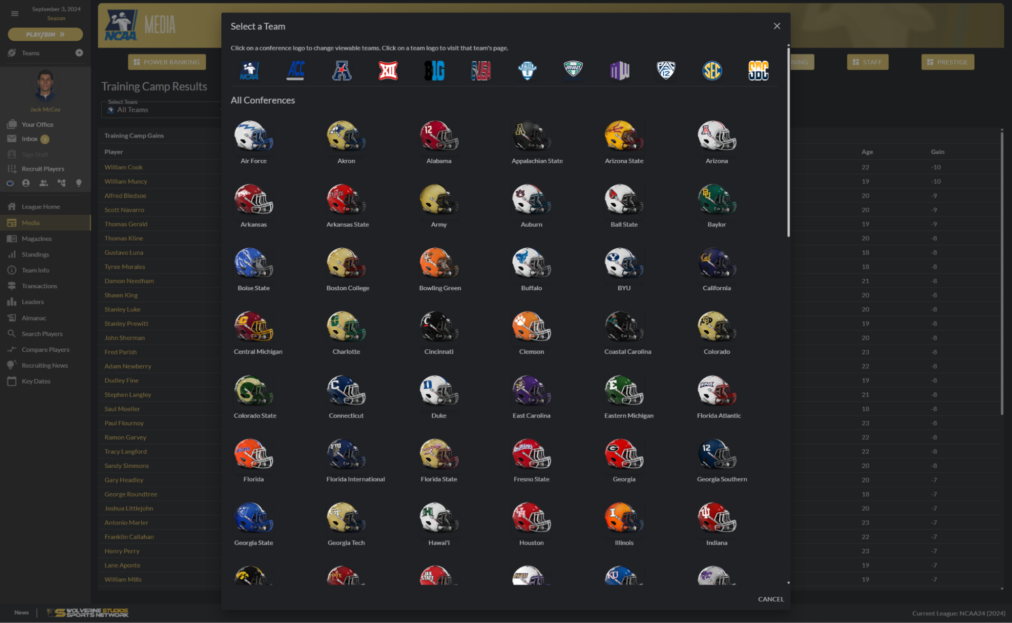
One thing I absolutely don’t like: The Teams screen.
Why is this like this? Why is this not a simple pulldown menu with conferences and teams? This screen is an unnecessary waste of time (clicks) and space, in my opinion. I’m sure others may like it. But it’s not for me.
When looking at how pages are organized…I was very unhappy with how information was accessed in the past, and how certain areas of the game–mainly the news and media sections–were tons of empty space. So I’m going into this with trepidation, but also in seeking out the positives. One page I rather like: Depth Charts.
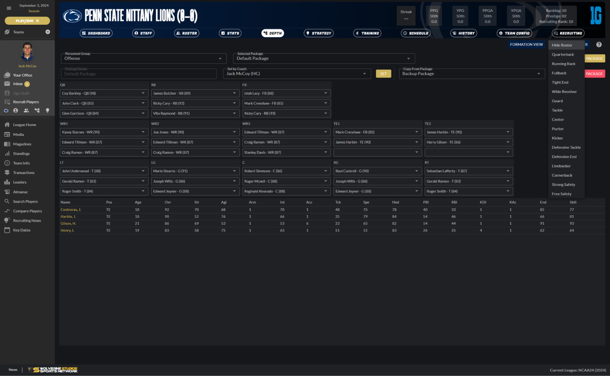 When you go there, you get the basic depth charts. However, in the top-right corner, there are two options: Formation View, and Quick View Roster. The Formation View is a pop-up that shows you what your lineup looks like in various formations. It’s fine.
 But the Quick View Roster menu…that’s pretty great. There’s a pulldown menu with all of the positions. Click on one, and it shows you the ratings of each of the players at that position. This can help you make more informed decisions, without having to go to different screens. It’s efficient and informative. I’m on board.
Because I’m apparently a tinkerer…if I wanted to improve this one way, it would be to simply click on a position within the depth chart, rather than the pulldown menu. But it’s fine the way it is. It’s just one extra click the way it is…though you’re scrolling ALL THE WAY TO THE TOP RIGHT MY GOD THE WRIST STRAIN IS REAL
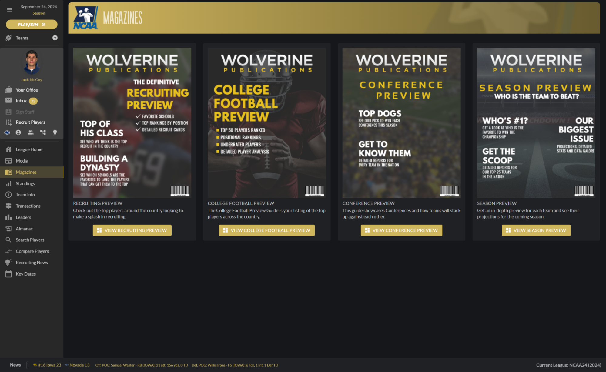
Anyway, one screen I still really don’t like: The Magazines.
The Magazines are supposed to be an easy way to learn about the world you are now in. And sure, that’s fine, to a point. But…well, what I was talking about, with regards to screens wasting real estate and not providing enough information…it’s right here.
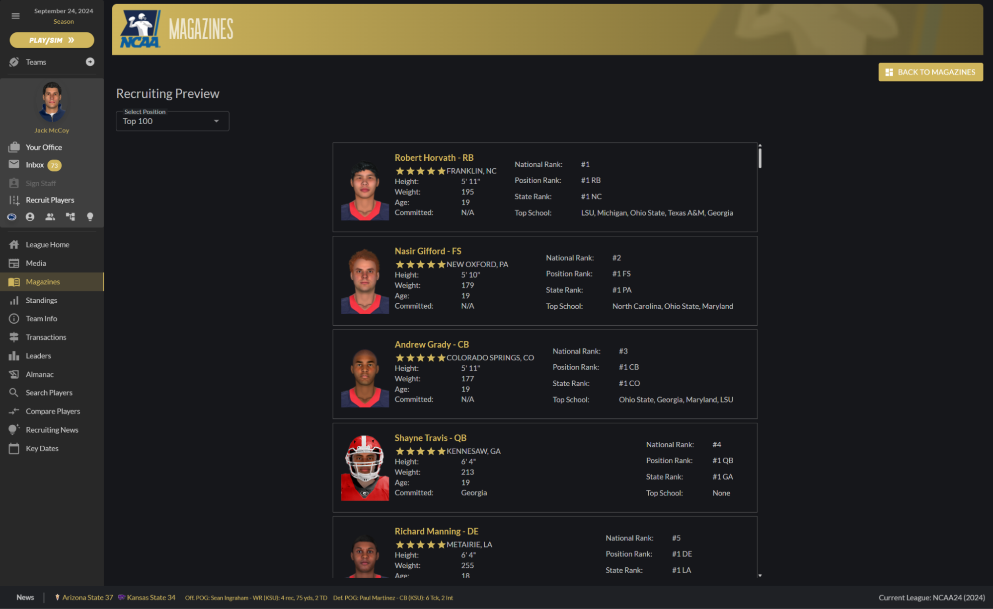
The Recruiting Preview is just a rehash of what you can get in the recruiting section. It’s uninspiring. That’s the best I can say about it. It’s disheartening to me, as I really get immersed into a world by the media that is provided. In previous versions, the way the media was displayed and handled is, far and away, my least favorite of any game I’ve ever played. To me, it’s disconnecting from the universe. I wish it were better.
By the way, one thing I learned: If you’re in the Conference Preview issue, and click on a team…there’s no way to get back to the issue. So you have to start over. This can be frustrating if you’re in a conference that isn’t the ACC, which is where you start.
The News section of the game is slightly improved from before, though not much. Previous versions, and this may be my DDSCFPTSD going here, but I remember previous versions of the game presenting news in just lines. Here, there are boxes. The font is better, the players are clickable (this is something that was available before)…but it’s still vanilla and repetitive. That is a major turn-off for me. Just…get away from the scrolling nonsense. Go to one screen, make headlines clickable, and have news occupy boxes on the screen.
I hated this screen before. I still hate this screen. For improvements (a recruiting article is a nice touch here) made, and for the visual improvements made…this screen being the equivalent of scrolling beige is an instant disconnect.
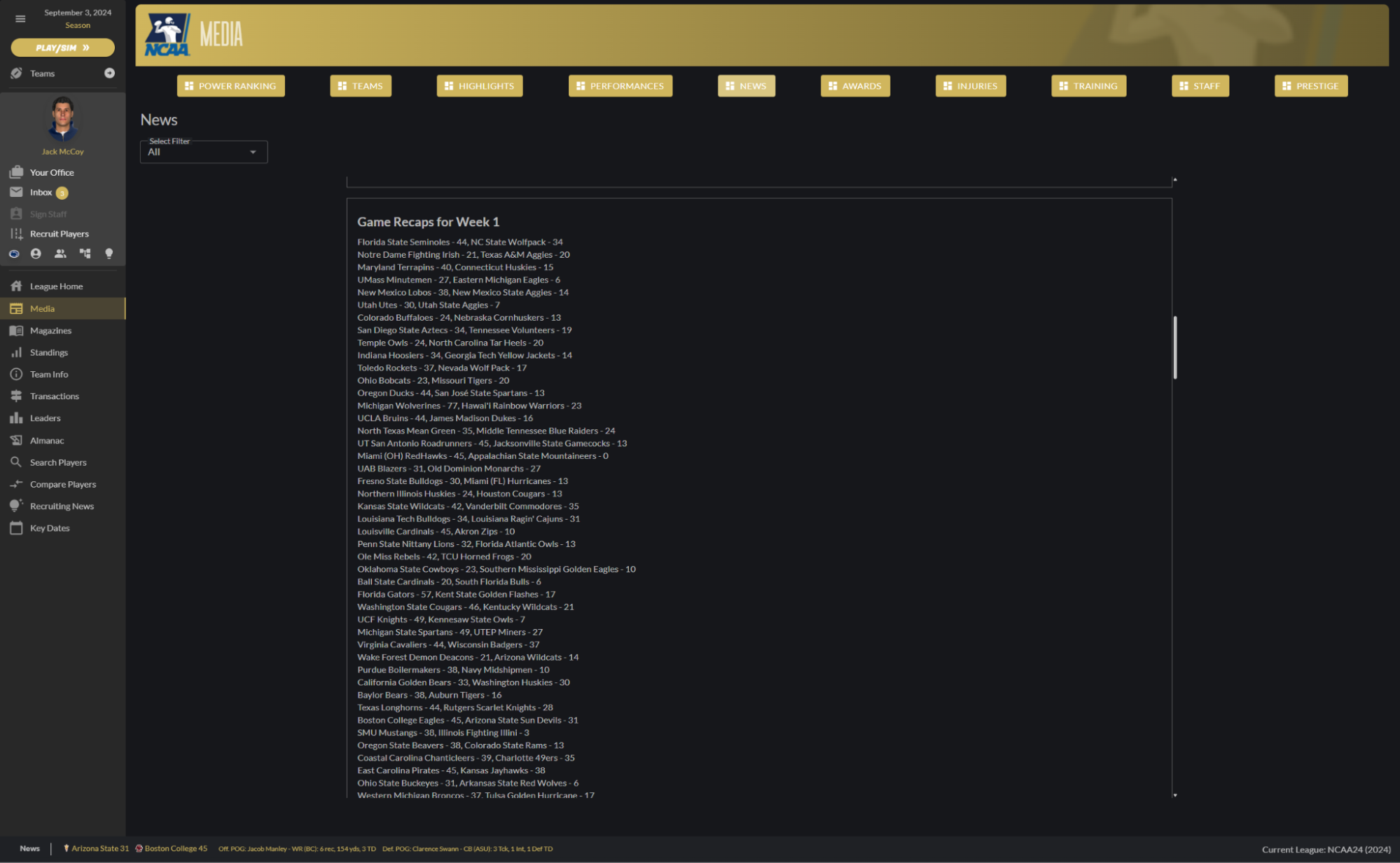
One thing that really frustrates me, and I remember this being a major issue for me before…the lack of basic organization…and links to boxscores…for “articles” like this screen:
Seriously, what the hell is this? Who is looking at this for more than a second? This is what I was talking about before: it’s a disorganized mess. Why aren’t these broken into ranked teams and conferences, and WHY ARE THERE NO LINKS TO THE BOXSCORES?! This is a waste, and it’s a waste of my time and energy. Stuff like this breaks the experience for me. You may think I’m overreacting to this, and maybe I am. But how can you make the improvements you’ve made to make this game look better, and then just leave this like people want it?
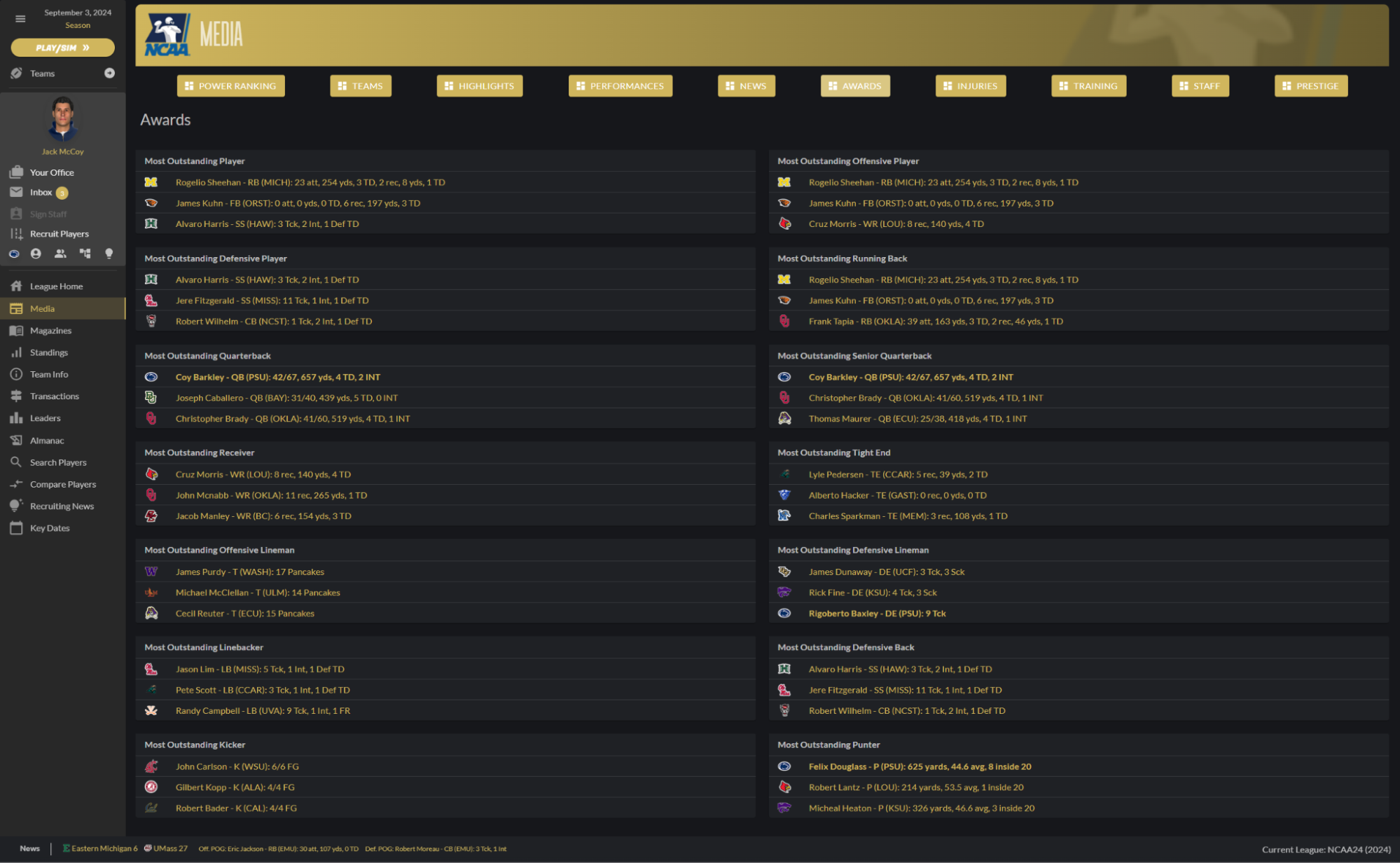
To be honest, the news section pisses me off even more after seeing the performance and awards screens. Those look fantastic, and more like what a game with 100+ teams and a mountain of information should look like. It’s all the more frustrating that the news section, which should be a daily driver of a text-based sim, looks the way it does.
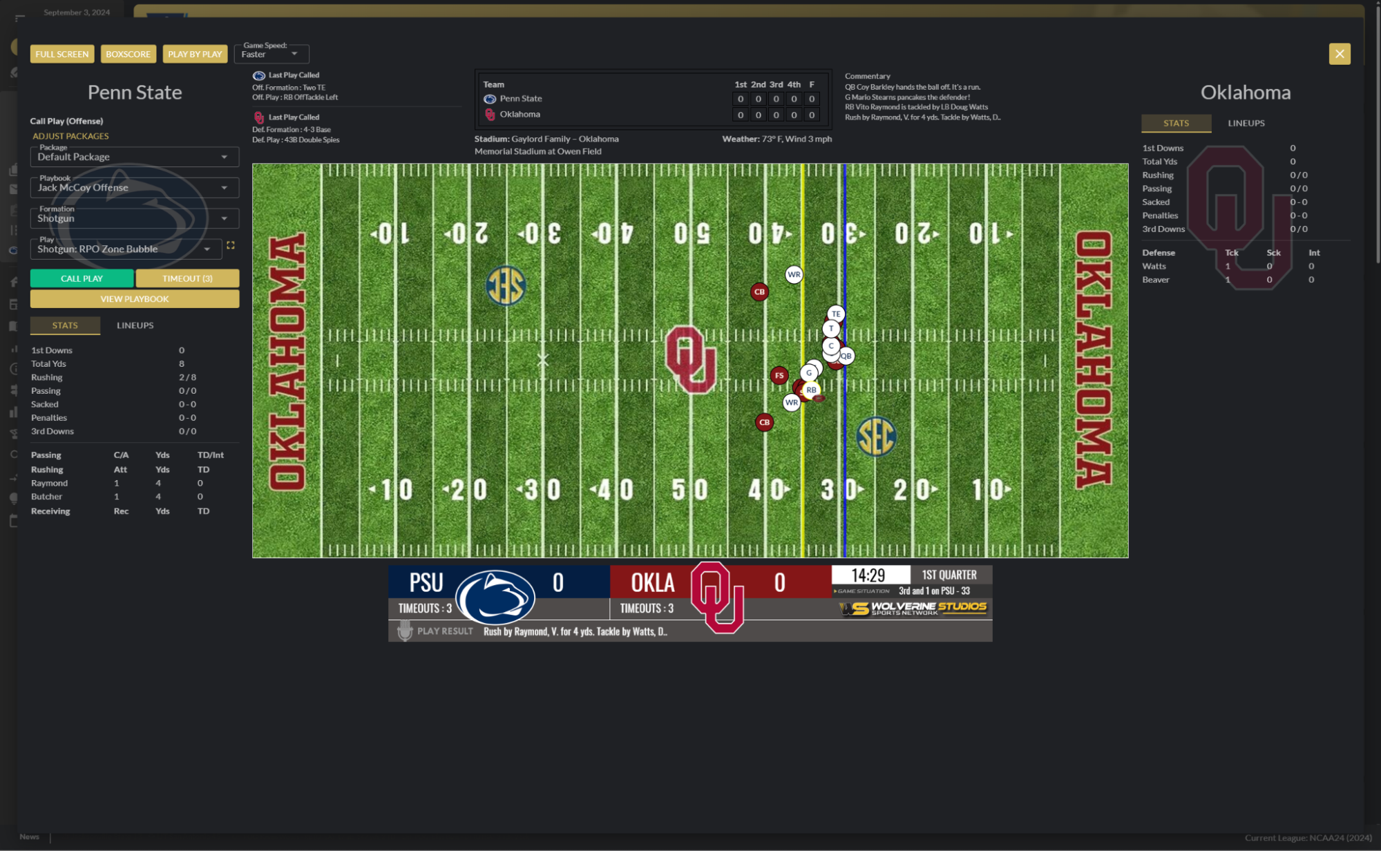
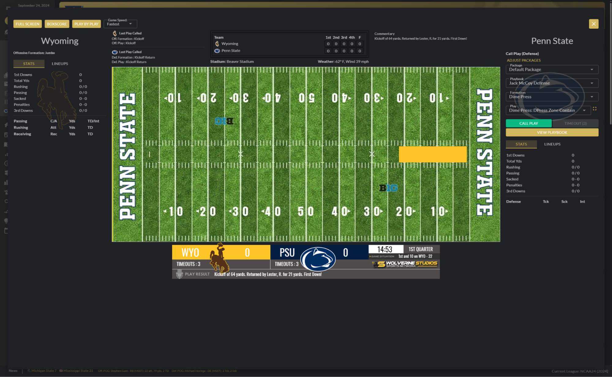
The game screen is better (low bar after what I just wrote); there are more games on the screen. The in-game screen hasn’t changed, as far as I can tell. You get the 2D screen so you can watch the game play out in real time. It takes up the vast majority of the screen, which is great. You get a scoreboard below the game, and then your coaching options on either the left (if you’re away) or right (if you’re home). Seems fine, right?
- Why are there two scoreboards? That’s unnecessary, and create consequences for other aspects of this screen. Pick one or the other.
- The commentary is shoved off the top right. It’s small. It should be highlighted as a way to help you process the game.
- ALL THE EMPTY SPACE BELOW THE SCOREBOARD BREAKS MY BRAIN. This could be where you put commentary. You could better line up the team stats and lineups below that screen. I’m not opposed to where it is now, but it would be better aligned if the stats and such were in that empty space.
The screen gives you plenty of information…but the amount of work your eyes need to do to go around the screen to process it all…it makes for an unsatisfactory experience. I’m fine with the information that’s on the screen, but it needs to be optimized for a more efficient user experience. Even just flipping the scoreboards, and putting the one with logos on the top, would make things a lot better, in my opinion.
The focus should be on the field first, commentary second. The way my game is set up, the commentary is the red-headed stepchild of the screen. I’m not a fan, and hope it changes down the line.
You can enter a full-screen mode, which shows just the field, and offers pop-ups for the boxscore and PBP. I’m on board with the screen…but you can’t call plays out of it. Again, there’s still empty space surrounding the scoreboard; why not allow for playcalling to the left of the scoreboard? You could have the opponent’s formation on the other side.
Customization
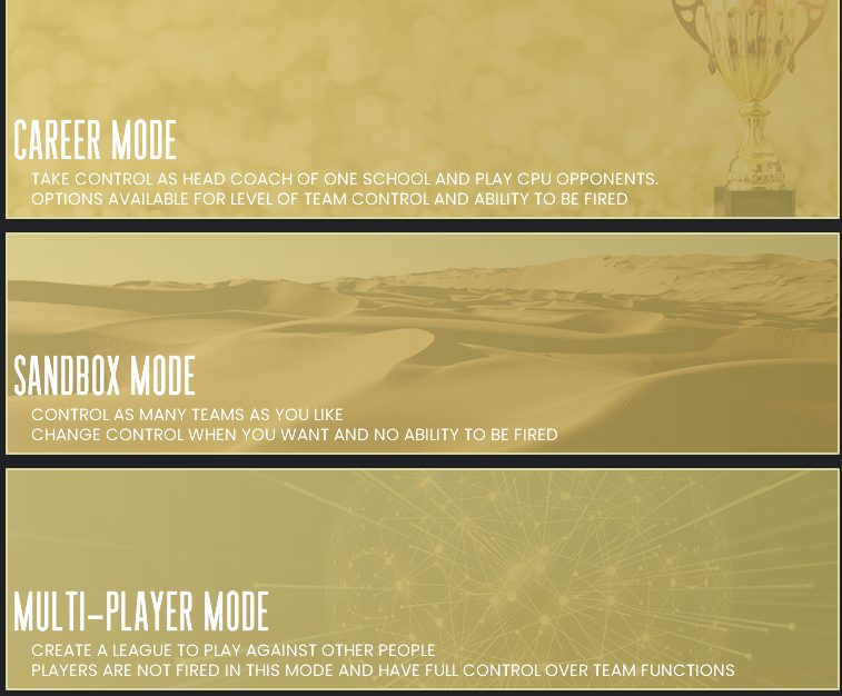
DDSCF25 offers three basic modes:
Career – Coach one school, variable level of team control, can be fired
Sandbox: Control multiple teams, adjust level of control anytime, cannot be fired
Multiplayer: Play against other people, cannot be fired
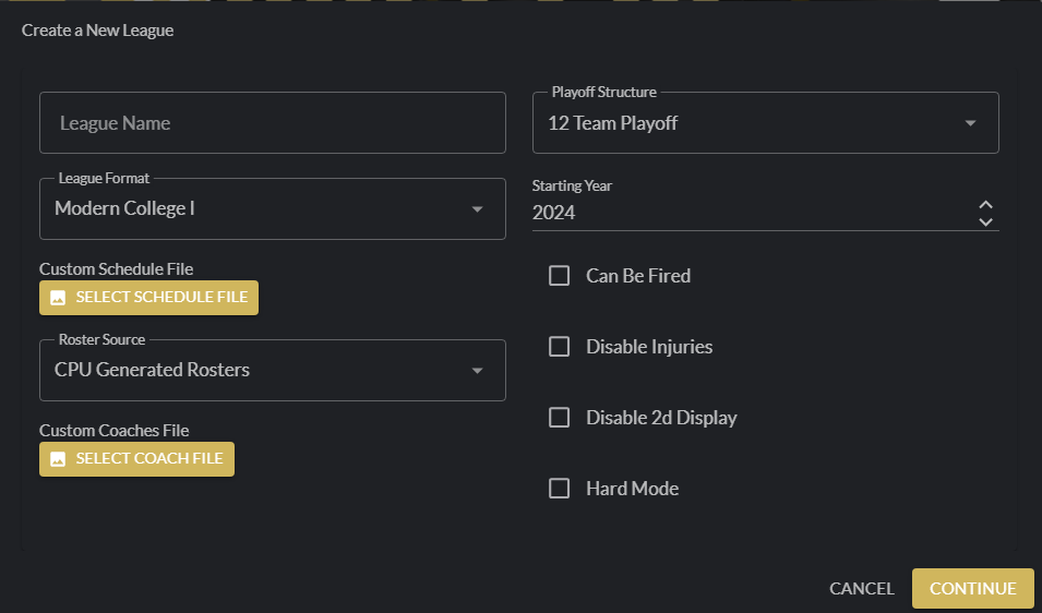
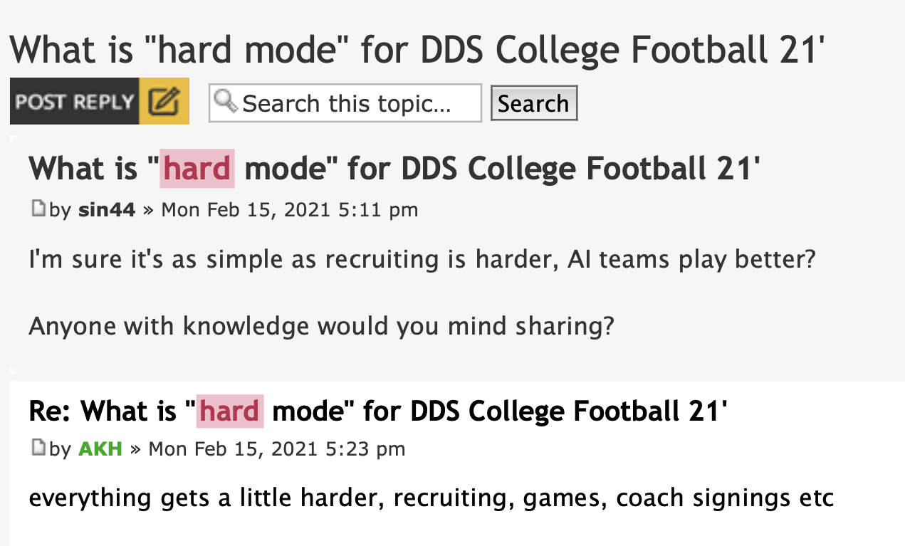
The other basic options are playoff structures (2, 4, 8, 12, 16, or no playoffs), your starting year, and toggable options to be fired, disabling injuries, disabling the 2D display, and hard mode, which is basically…well, things are harder. All I could find from research was this, taken from the WS forums.
Those seem pretty par for the course for most games. However, what comes after is rather intriguing.
The default league format is Modern College I. However, there is a custom option, which you can use–presuming you have some XML editing experience–to create your own landscape. Given the landscape of today’s college football environment, I would say this is a major plus.
Before you get on me: Yes, I know it has been around for many versions. It stands out more prominently now because of how screwed up college football has become. Also, this is the customization section of the review.
Looking at the mods section on the WS forums over time, there have been some other formats created by users. Take OOTP historical legend Tiger Fan, for instance. He created a 1970s era, 82-team format back in 2019.
As always, slybelle1, the MVP of Wolverine real world application, has their Real World Mod already linked in the First Access forum. This is a must for anyone, unless you want to go completely fictional. And that’s totally cool if you do.
I need to note that you seem to need to create a dummy league first, so that the folder the mod writes to, located in your documents, will create. At least, that’s what I had to do. There is also a Documents Folder Finder app that will help you find the folder you need, if you need the help. (That said, I did test it out, and copied the location from inside that app…when I pasted the copied text into the RW Mod app, it only had DOCUMENTFOLDERFINDER RESULTS. I had to go and physically highlight and copy the location. That was my experience; yours may be different.)
The last piece of the customization is with your head coach. There are plenty of options, though it’s pretty obvious Wolverine only purchased one facepack and clothing set for all of their games. I have no issue with that at all, as to me, it’s fairly inconsequential. I just rather enjoy that I can have my coach wear what my DDS basketball coaches wear, which is basically the chill teacher look.
(As a long-haired weirdo that wasn’t a long-haired weirdo until the pandemic, I am still terribly upset that there are no options for long-haired weirdos. We hippies just have to conform, man.
There are two additional facesets here, but this feels like an ultimate troll. It’s just fifty bald sets.)
Now, we have to come back and talk about something. Yes, you can also create your own schedule and rosters; I know that is difficult on its face here, because of how vast college football rosters are, and how difficult it would be to figure out ratings for average-to-good-but-not-great players if you tried to create a historical roster.
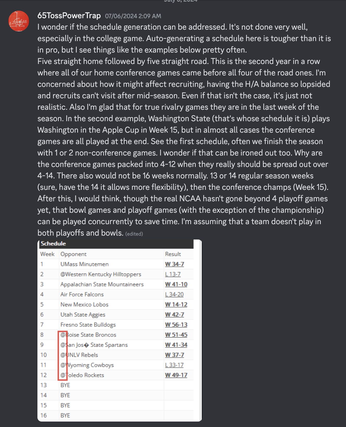
The same goes for schedules, and this is the more frustrating aspect of DDSCF. You can create a custom schedule using a CSV file, which is fine. However, there are concerns here. I’ve been reviewing comments regarding scheduling on the Discord, and these are all recent (though, admittedly, with DDSCF23…I don’t think they are part of an open beta period, but I may be wrong).
This is a valid concern. How a school has five straight home games, then five straight road games, makes no sense whatsoever.
Looking at this in my initial DDSCF25 save, and this is going off an extremely small sample size…I haven’t come across anything that really sticks out as immersion-breaking. Here are the main things I see…and again, this is in one season of one save.
- Utah has games in Weeks 1-6…then an open week. This is followed by three games, then back-to-back open weeks (11-12). This wouldn’t happen in the conference schedule. It’s easily rectified by moving, say, the Baylor (Wk 4) or Cincinnati (Wk 5) games to week 11 or 12.
- Utah also goes to Tennessee the final week of the regular season. I’m not sure how to feel about that.
- UConn has back-to-back opens in Weeks 7-8. They’re independent, and there’s probably some constraint in getting a game there.
- Liberty is off for the first two weeks, and again in Week 4. They have no open weeks the rest of the way. Again, this isn’t too much of a concern. It just sticks out, compared to other schools I’ve seen.
Where I worry about schedules, especially with these ridiculous monstrosities of conferences we have now, is in later seasons. I have no idea how the schedule turns over, and if there are set patterns in conference scheduling. But could there be a thing where Auburn and Alabama, who do play here (though in Week 12), don’t play in the future.
(Author’s note, as I have circled back to this after the game has officially released; I’m seeing more schools with several weeks to their season before their first open week. And I’m seeing a couple back-to-back open weeks late in the season. But overall, the schedules look decent.)
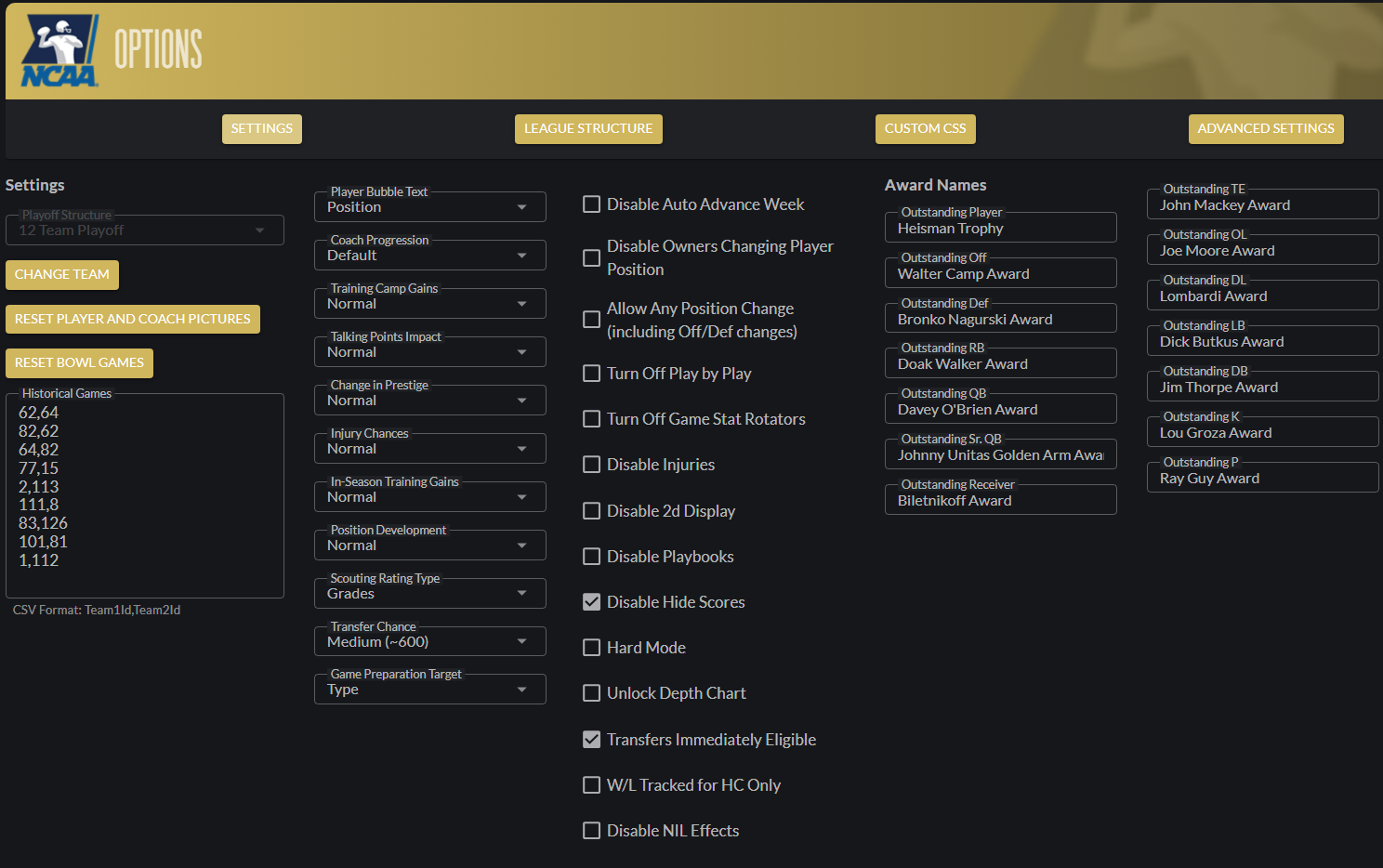
Is there a way to hard-code rivalry games into a certain week of the schedule? The answer to that appears to be no. There is a place to hardcode historical games; however, that is working under the assumption that you know team IDs.
There are issues with creating custom schedules, based on what I’ve seen in comments in various places. Mainly, the issue is that there are a ton of moving pieces, and it is hard to keep track of everything…making it even easier to make a frustrating mistake. While there are some folks who have created mods and have shared (or shared but just kidding, apparently), the basic gist is that you have to have great organizational skills, a bunch of patience, and some technical ability rooting around in core files, to achieve such a thing.
So, why isn’t there an editor already? These core files don’t change that much from year-to-year. I understand why Gary Gorski doesn’t necessarily do it with his games, as he wants to simulate the current basketball universe as accurately as possible. But Brooks has always been about customization. Why can’t there be something more user-friendly to help achieve this? Why do we need to rely on the community AND have knowledge of how to properly edit the Teams.xml file to play the game the way we’d want?
If an editor cannot be built, would Brooks be willing to create a base set of configurations? I understand that’s a bunch of work; however, if you’re going to offer the ability to do it, shouldn’t you ensure that the people who wish to use it can do so without worry that they’re going to get the first 527 steps right before messing up step 528, making the rest pointless?
(Note, this actually happened. William Shanks, an amateur mathematician, counted out PI to 527 places correctly. He messed up at 528…then continued on until he got to 707. He spent decades on this. I don’t want to feel like William Shanks probably did when he realized he screwed up twelve years ago, and that the past twelve years were spent in horrible pointlessness.)
I don’t think this is an unreasonable request. It’s in the game, but it’s not very well supported. This could be, in my view, one of the biggest available features for this game. But since it’s so difficult to do…it gets underutilized. I know I want a different configuration than what we have now; I’d rather want something akin to the early 90s. But with no safety net on such an endeavor, I feel defeated before I even step out on that tightrope.
Please, Brooks…help us out on this, somehow.
The one other thing that appears inexplicable: No commish or unemployed mode anywhere? Want if I want to fast sim 10 years into the future and pickup from there? In Sandbox mode, you can fire a coach, including yourself. So I guess that’s one way around it. But there’s no way to start unemployed in this game. As someone who likes to build a history, this is disappointing.
One other thing I’m.
Gameplay / Sim Engine
The game places you into your coaching role on August 1st, before Training Camps…but after scheduling. I wrote about this in my 2023 review; it’s frustrating, because I’d like to schedule Pitt for my Penn State Nittany Lions. In the grand scheme of things, it’s not the worst thing for the first year.
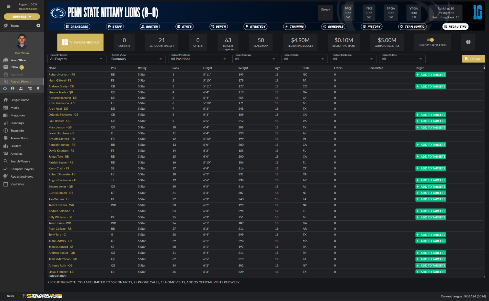
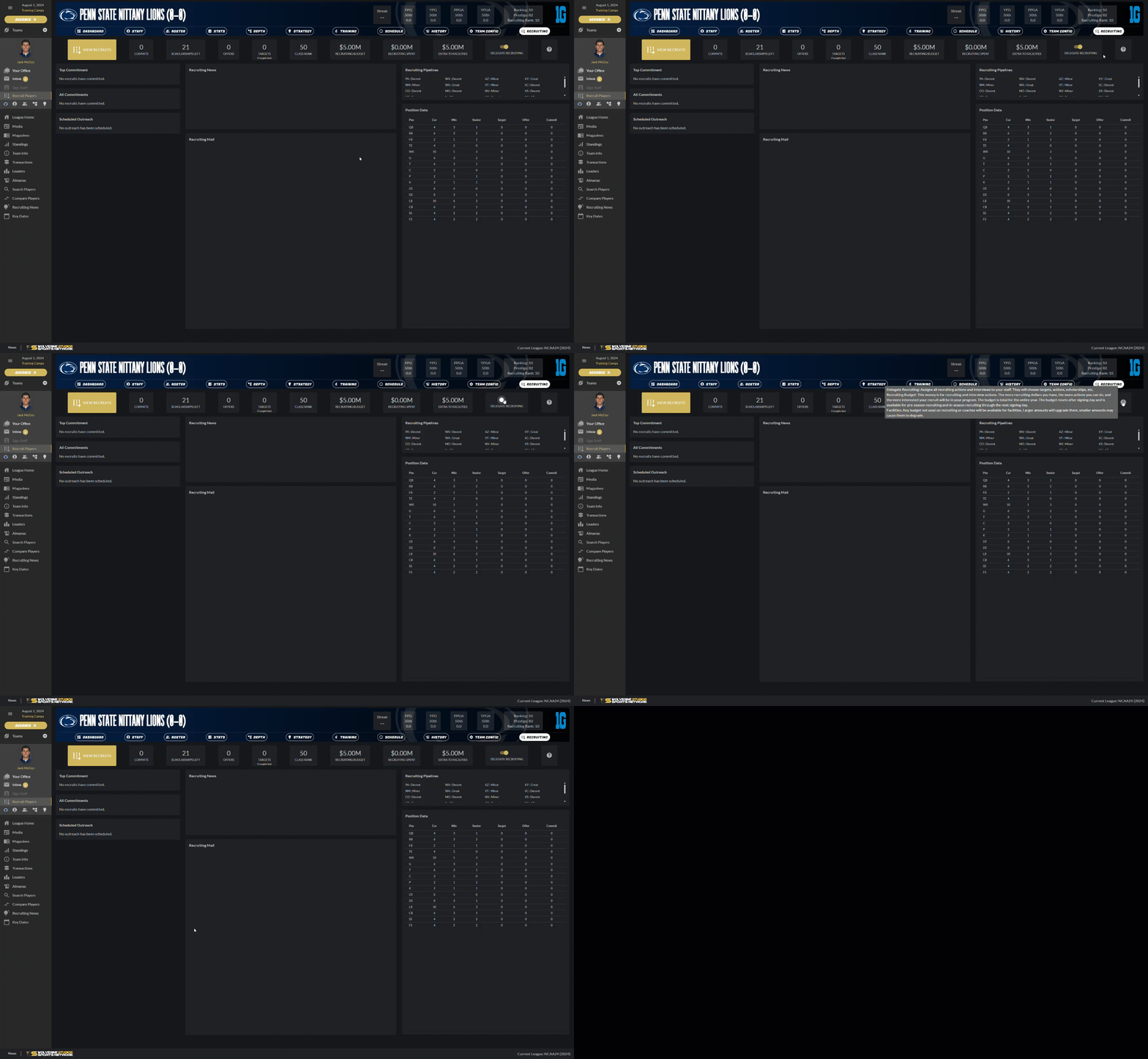
You can jump into recruiting by adding players to your targets. One thing I like: The ability to delegate recruiting. In previous versions of this game, recruiting was an albatross to me. It was haphazard, random, with no rhyme or reason to what I was attempting to do.
I also like the dashboard. One thing I’ve really not liked about previous games is how information is accessed. There was too much empty space. DDSCF25 still has some issues with dead space…but it has also improved. I like the position data and recruiting pipelines section, though I think they could be positioned better, so that no scrolling is necessary. This could be directly tied to my resolution (2560×1600), too…so take that as you will.
I do wish the positional needs were available on the main recruiting screen…even just as a “need” in the chart. There’s space next to the Target column, which would be perfect.
One thing I’ve noticed: the AI will target three recruits for every possible opening. So I have three senior wide receivers, and my staff is targeting nine receiving recruits. I really appreciate it shows you how many targets you’ve lost, which you can see under the total targets you currently have. That’s a very nice touch.
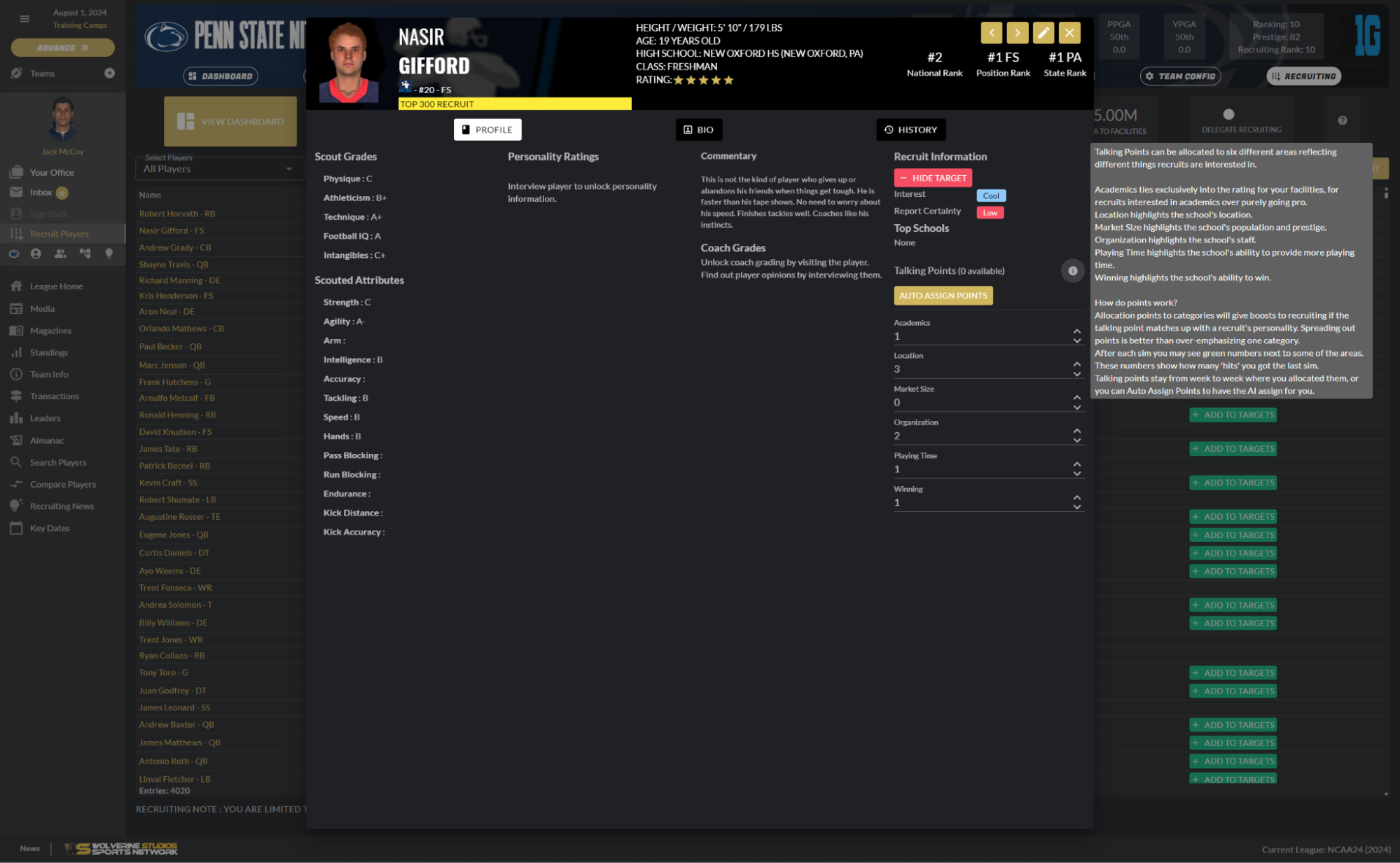
When you target a recruit, you get the basics of their scouting report, some commentary, and talking points. This is in line with DDSCB, where you are trying to pitch various things to recruits.
The in-game experience is fine; I’m sure there are improvements over the years, I have no tangible way of telling you what the improvements are. Brooks is active in the community and offers patches regularly. However, I can’t give you a statistical argument as to whether the game plays like football or not. In my experience, it does. That said, I just noticed something. It’s this.
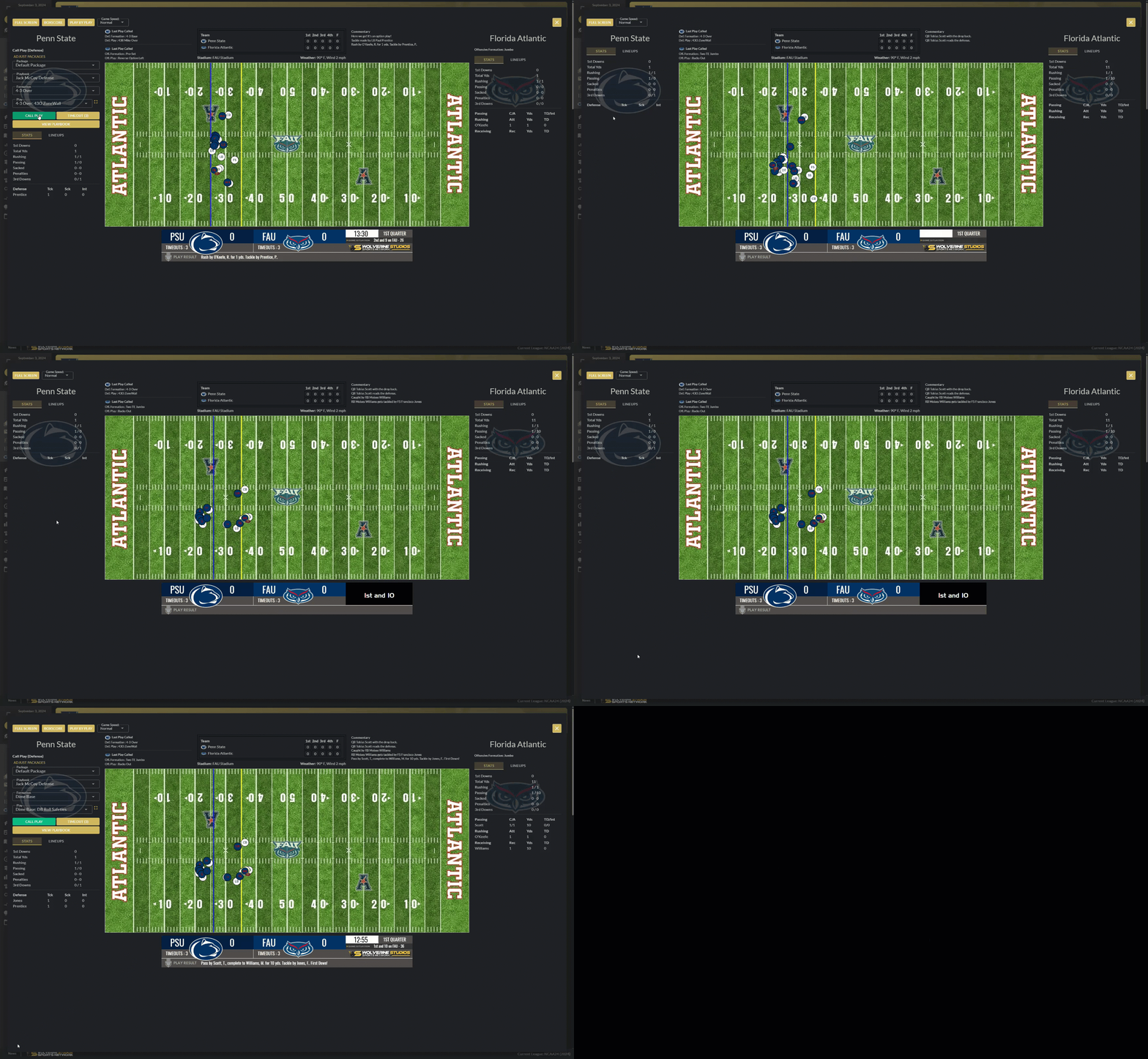
If you can see Wyoming’s offensive formation (yes, it’s really tiny)…they’re in the Jumbo formation. Why is it suggested we run a Dime Press Zone Contain as a result? Why do I want six DBs against a run-heavy set with what is likely one receiver on the field?
I switched to a 4-3 Mike Over; sure enough, they ran a QB Dive. The next play, they went shotgun, so I switched to a nickel. They ran a RPO. On third and four at their 27, they went back to a Jumbo set. My defense…went back to a Dime Press. What do I not know about this formation that I should? Why is it suggested against a Jumbo set multiple times?
I ran it, and we stopped them. So, 4th and 4 on their own 28…here comes the punt team. My coaching staff suggested we go to the Nickel. I said sure and called it. The game overrode it and put in a punt return, so that I, the user, didn’t so something so brazenly stupid as run a nickel set on 4th-and-4 from their 28.
So…maybe there’s some hiccups with the playcalling. Again, I’m not an expert; what I’m putting here is anecdotal. But it’s something to look at early on in your own dynasty.
Overall: The basics here are recruiting and in-game coaching. That’s to be expected, and from what I can tell, it continues to do a decent job. Having a developer who continues to tweak the engine is extremely beneficial. This is one shining light for Brooks. Basically, if you like calling plays, and you like recruiting…this is for you.
Online Modes
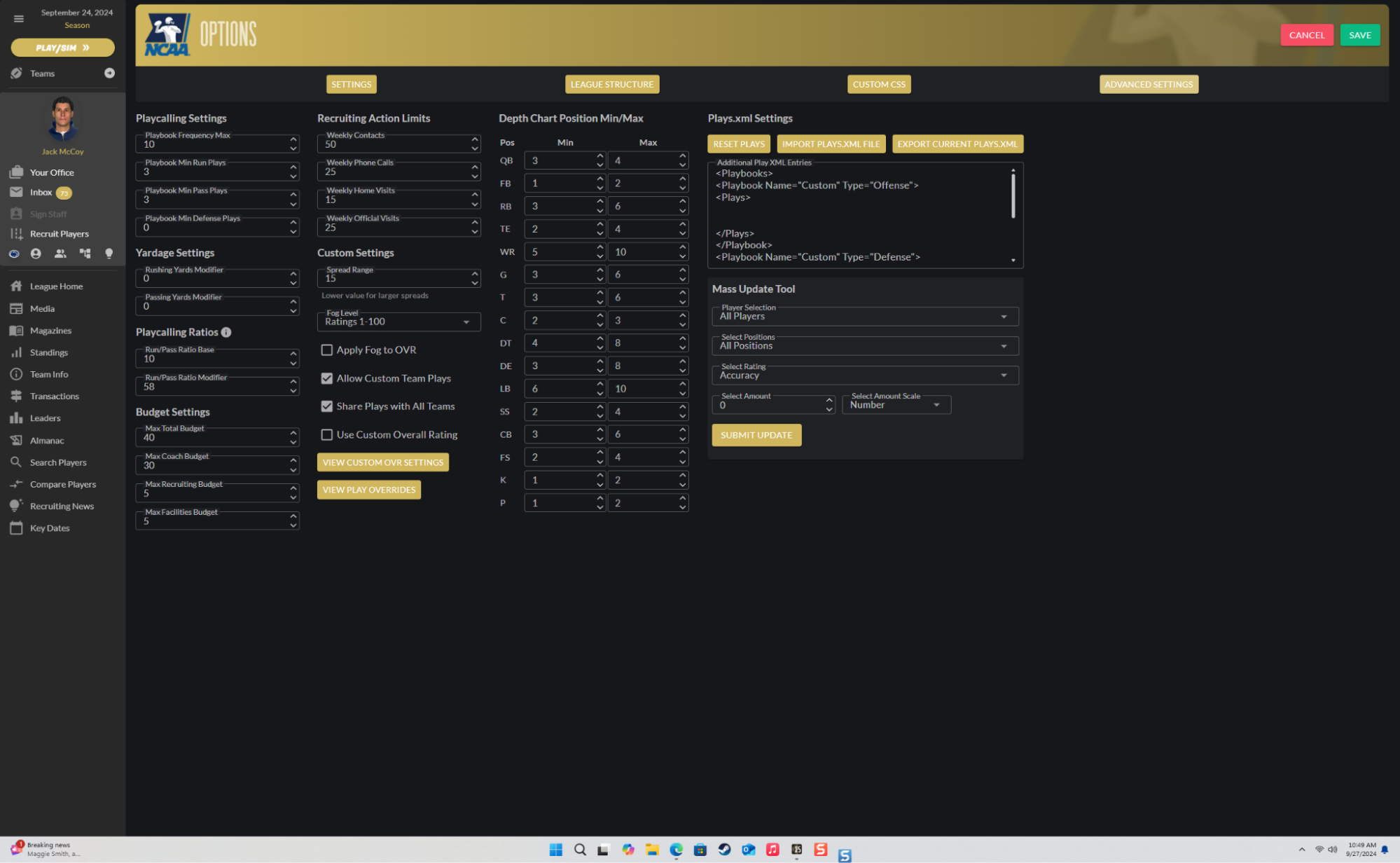
It exists, yes. There’s not much else to say about it. This game was made for online leagues. So you can expect a reasonably streamlined experience for a commissioner, as you can see below.
Overall: There’s really not much to say here; it exists, and it does what it’s supposed to do. As I say with this section each time…this is more of a pass/fail.
Fun Factor
I won’t beat around the bush here. This game isn’t for me, specifically. I’ll explain why in a bit. That makes it hard for me to grade this section. But I think I have a way, so I’ll try.
If you like calling plays, building a system and recruiting to build that system, and look at things like the media as simply window-dressing, then this game is very much for you. Some could view this as repetitive; to that, I say…have you met text sims? Or most games? Of course they’re repetitive. The key to any good sports sim is to make it feel not that. With as much customization as there is in the game (as cumbersome as it may be to do in some cases), and with as many different ways you can build a winning program, DDSCF does more than its part to fight off repetitiveness.
However, if you like having that fourth wall setting in around you…this game will leave you wanting more.
(I’m sure you were expecting more here. So was I.)
The best thing for you to do is use what you have just read as a small guide, but go try the demo, and see for yourself.
Official Download for Draft Day Sports: College Football 2025
Leave a comment for John or GM Games on reddit…

