If you go into playing MLB Manager 2015 with the idea that you’re getting a stripped-down version of OOTP ‘16 for your desktop, well, that’ll tell part of the story. Sure, there isn’t as much details as a game that we gave a 98/100 just a couple months ago.
And for an iOS game, of course that level of detail won’t be able to be condensed down into a version that’ll fit on your phone. But honestly, this year’s iOS version gives you pretty much all you could handle in a handheld version.
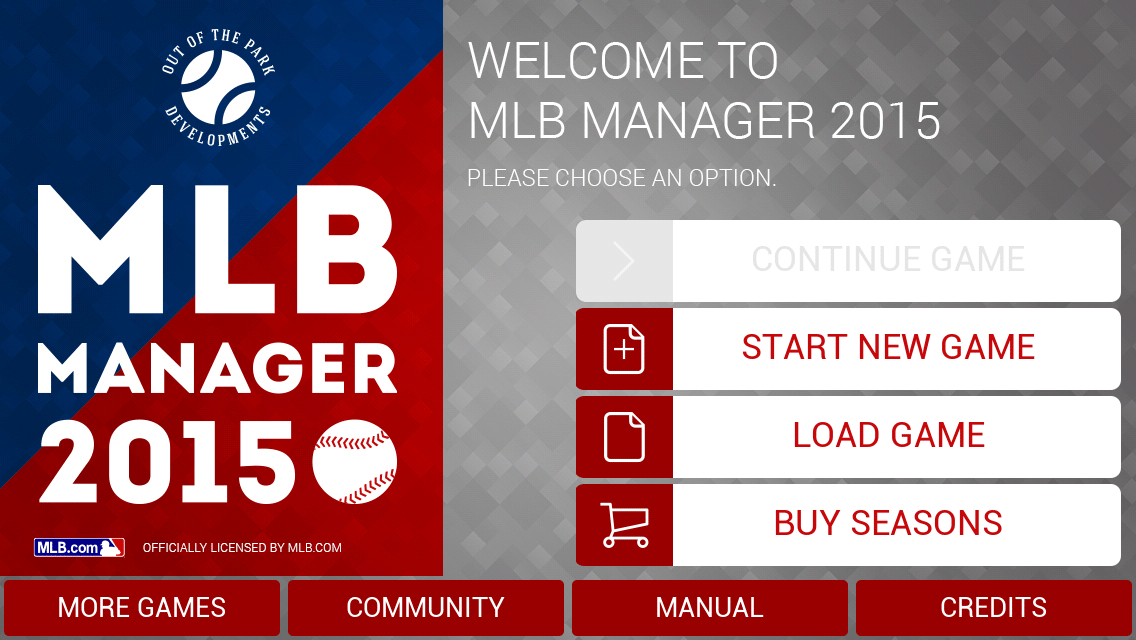
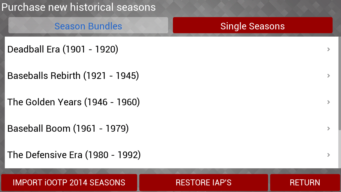
Here’s a look at the open screen. For the buy seasons option, you can either buy individual seasons, or packs such as these:
…which will seem awfully familiar if you remember from the desktop version. One thing that did give me trouble in this part of the game was backing out of these menus, as the load screens had a tendency to catch. Similarly, and this may have been an issue isolated to my almost two-year old phone, but the bottom right buttons didn’t work — such as return in the previous picture — unless I had my phone in one specific direction. That was a little odd, but again, possibly just a problem on my end.
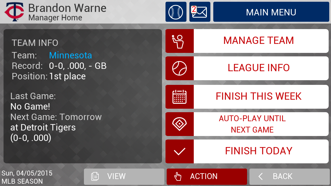
When you start, you get a truncated version of the opening options from the desktop game, along with the space to enter your name and decide if you want to run a fantasy draft — something I opted not to do. Then, it brings you to a landing screen that — especially if you’re daunted by the one in the desktop version — is a really nice balance of detailed but not particularly cluttered.
The interface is intuitive, and the menus are easy to navigate with the buttons of adequate sizing even for someone with sausage fingers such as myself. I had little trouble setting my opening day lineups and rosters, and the faster loading menus in this part are what led me to believe my earlier difficulties were isolated issues.
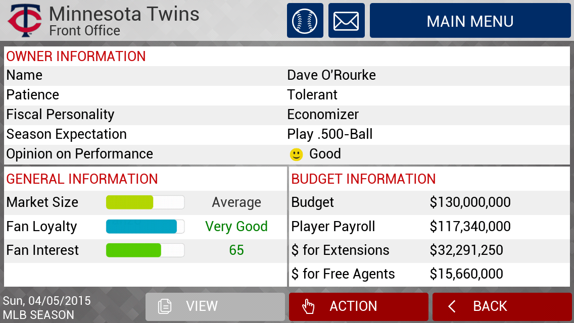
A quick exchange of emails between me and my owner lets me know that he expects a .500 team, and it’s time to check the rosters and see how accurate they are.
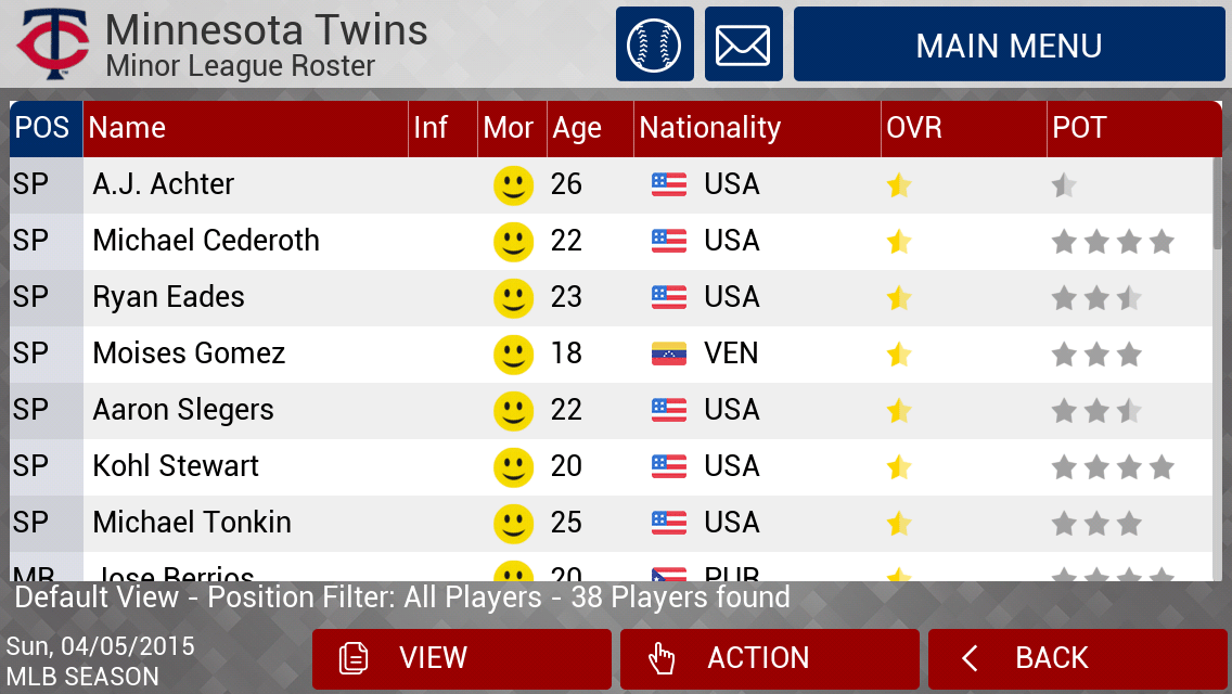
For a minor league buff such as myself, it’s easy to get lost in the vast array of depth on the desktop version. On the iOS version, it’s stripped down a bit, as there’s just “the minor leagues” as a general concept rather than individual levels.
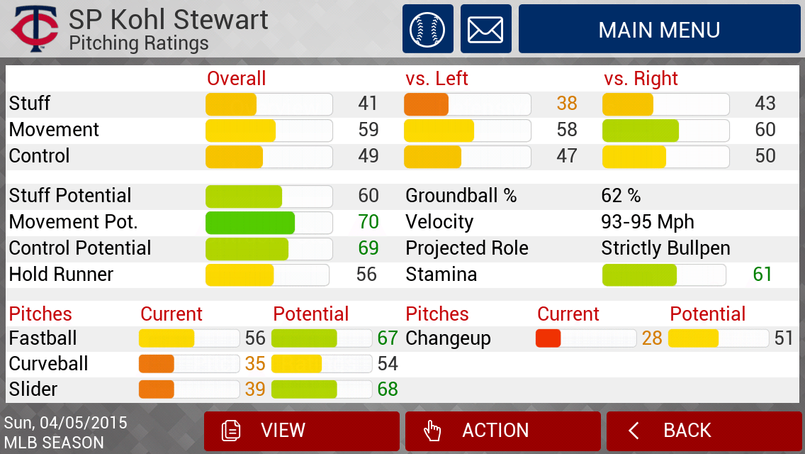
For Michael Cederoth, a recent Twins draft pick, I wanted to get a feel for how accurate his ratings were. On his player page, I have the option of making the following suggestions — all of which are super-intuitive. I did the same for 2013 first-round pick Kohl Stewart:
Those ratings adequately mirror the general expectations for Stewart’s ceiling as a potential big leaguer. In short, the ratings are accurate, and that’s a huge plus in this game’s favor. The same goes for uber-prospect outfielder Byron Buxton:
As noted, the game is full of easy-to-navigate menus that will give you pretty much all the information you could ask for:
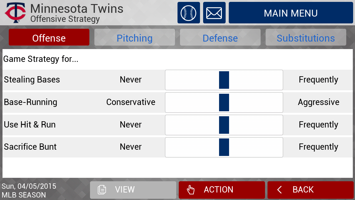
Customization is also key, not only in that you can edit each of your players to fit your whim, but also in terms of in-game specifics. Now, when you’re playing each game individually it’s easy to call for a bunt, a steal or to take a pitch for instance. But if you prefer to be a caretaker from a distance, you can use dials to ratchet your preferences up or down in the game’s finer points:
Prefer to be a small ball style manager with bunts and baserunning? Easy peasy. Or are you more like me, a Moneyball-style guy who prefers not to give away outs on the bases or at the plate? That’s no tougher either, as I’ve been known to manage teams that attempt fewer than steals a season. It’s all about knowing your personnel and what they’re capable of, especially in a game with this sort of depth.
Speaking of depth, global depth charts make it easy to make sure your guys get rest when they need it. And not only that, but that they’re replaced by the proper utility players on the proper intervals. This is nothing new to this iteration of the game, but it’s still interesting and noteworthy nonetheless.
As you can see, that’s the default Twins lineup for when the game is booted up, and it’s exactly the Twins’ Opening Day setup as well. That’s a nice bit of realism that might go unnoticed by the casual fan.
The drop-and-drag setup to move players around the batting order is an extremely easy feature to use, and makes issues of having to navigate multiple menus — especially on a phone — a thing of the past. For some reason the game had Trevor Plouffe batting leadoff and Brian Dozier batting fifth, but a quick drop-and-drag fixed that problem in a quick hurry.
Now, we’re ready to go to battle.
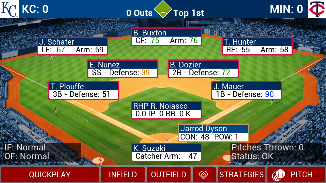
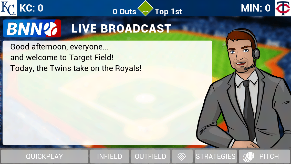
You could almost be convinced you’re looking at the desktop version as it pertains to details on the play screen. This is where your creativity can really run wild, as you can call for numerous different plays based on situations, tendencies, and pretty much anything else you can imagine.
A nicely-dressed young man has the call, and we are underway. The in-game menus play pretty much exactly like the desktop version, with the ability to pitch around guys, take pitches, steal bases, hit and run and pretty much any other in-game strategy you could devise.
It isn’t long before our first trade offer comes in. It isn’t particularly interesting, but it’s probably pretty realistic. These will roll in throughout the season, and in an interesting twist, in larger numbers in the offseason via a “Winter Meetings” feature.

The June draft is five rounds, and while the scouting for it is not quite as in-depth as the desktop version, there’s still plenty to think about as you prepare for each of your selections. Players are a little easier to sort through — thanks to the sheer number of how many fewer there are, no doubt — but a five-round draft given the depth — or lack thereof — with the farm systems in this game seems to be a good fit. Gone are the July 2 international signings, but that’s a mode that’s arguably as deep as the draft in the desktop mode, and with no ideal way to pare it down really. That might be a deal breaker for a die-hard fan, but for a casual player it probably is still alright.
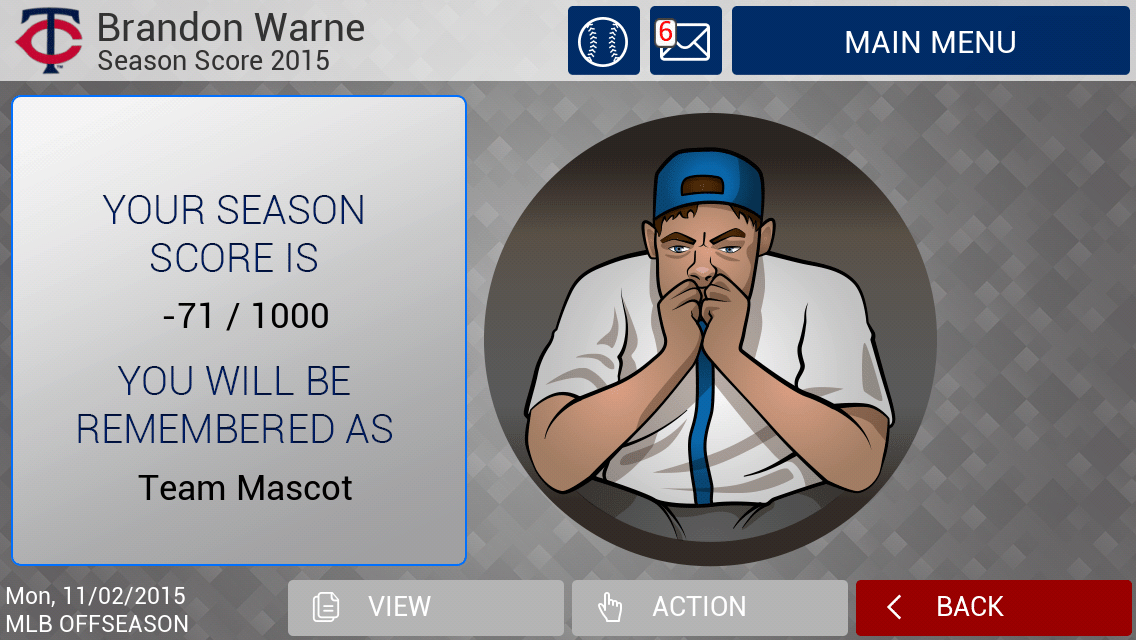
As you can see, the first season didn’t go terribly well for Mr. Warne and the Twins. That however doesn’t mean that the game didn’t deliver.
iOS users might expect to find a game that’ll be a time killer between meetings and on flights.
This has potential to be much more than that.
