It’s another March. And I cannot help myself.
I am a college basketball nerd. And that continues to lead me back to Wolverine Studios’ Draft Day Sports: College Basketball series.
Author’s Note: I am reviewing a FirstAccess build, which you can get by pre-ordering. This is not a review copy; I purchased the game myself.
And that, inevitably it seems, leads me back here, writing another review for you. I wrote one last year. And the year before that. I was unable in 2021, but was at it during the pandemic.
I was going to take a break this year. I am a teacher. I won’t speak for all teachers here. But I am burned out. My weekends are generally spent resting and recuperating. I also have a side gig hosting trivia nights; yes, that means I spend evenings grading adult worksheets. (I’d make a joke about my life choices, but I do rather enjoy it.)
The thought of writing a review, especially one to my standard, feels daunting. And yes, if you have read my reviews before, I admit they come across as long-winded. You may want me to get to the point. For a text sim, one with a definitive wall that is built on imagination, I believe I don’t do these games justice if I don’t attempt to bring you into the world as I see it. I admit that it is a bunch of pressure I put on myself for these. But I do not wish to commit to something unless I think I can do what I feel is a complete job.
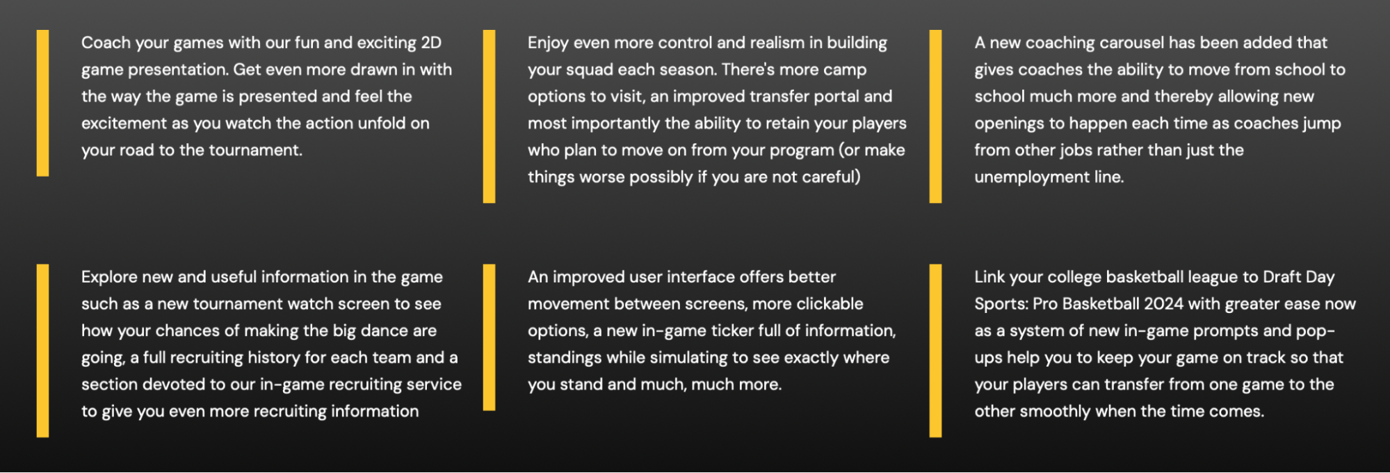
But then UConn won a national title, and looks even better this year. The Big East has returned to, if not what it once was, then pretty damn close. And Gary Gorski, the founder of Wolverine Studios, and developer of both the Draft Day Sports: College Basketball and Pro Basketball series, added some elements to this year’s game that are intriguing. Some of those features are found here; some are in the graphic below.
And now, here I am…writing another review. Is it worth my time and energy? Is it worth yours?
Let’s find out together.
(Author’s Note: Here are the specs for running the game.
I point this out to note something for MAC users: I am playing this on Windows Parallels, a Virtual Machine program available. I had a trial to Crossover, but that was before this came out. I will note my experience playing on Parallels later.
For reference, I have a MBP M1 Pro 16”.)
(Also Author’s Note: I own handhelds. For some reason, I have a bunch of them. I almost went in and told you why I have a bunch of them, but I refrained. That’s progress.
Anyway, I will tell you that the reason I have a Legion Go is because of games like DDSCB and OOTP. The bigger screen makes it easier to read than on, say, an Ally. So here is my quick DDSCB-on-The-Go review:
The game runs great on it. The game looks great on it. Sure, the screen is smaller than you would want for the game…but it does play very well. There is one caveat, at least with my Go, so far. When you load the game, it does this weird thing where you can only see part of the screen. At first, the game starts cut off at the top of the screen. Then it shifts to cut off below the screen.
The fix for this, I have discovered, is to switch the resolution, then switch it back. That resets the game alignment, making it easy for you to play.)
Graphics / Interface
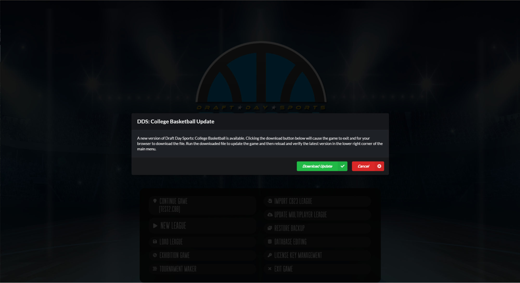
One thing to point out before I even get going: The game now pushes updates out to users, rather than users having to go to the website to download. This is a lovely addition; even lovelier is that you don’t have to accept the update straight away.
Two of the key features of DDSCB24 involve the interface. Both are rooted in getting the user to pertinent information more quickly and efficiently.
Let me start with something I really like: The Team Dashboard has gotten some enhancements. Three areas of this page–Standings, Roster, and Recruiting–have been given buttons that toggle to additional information.
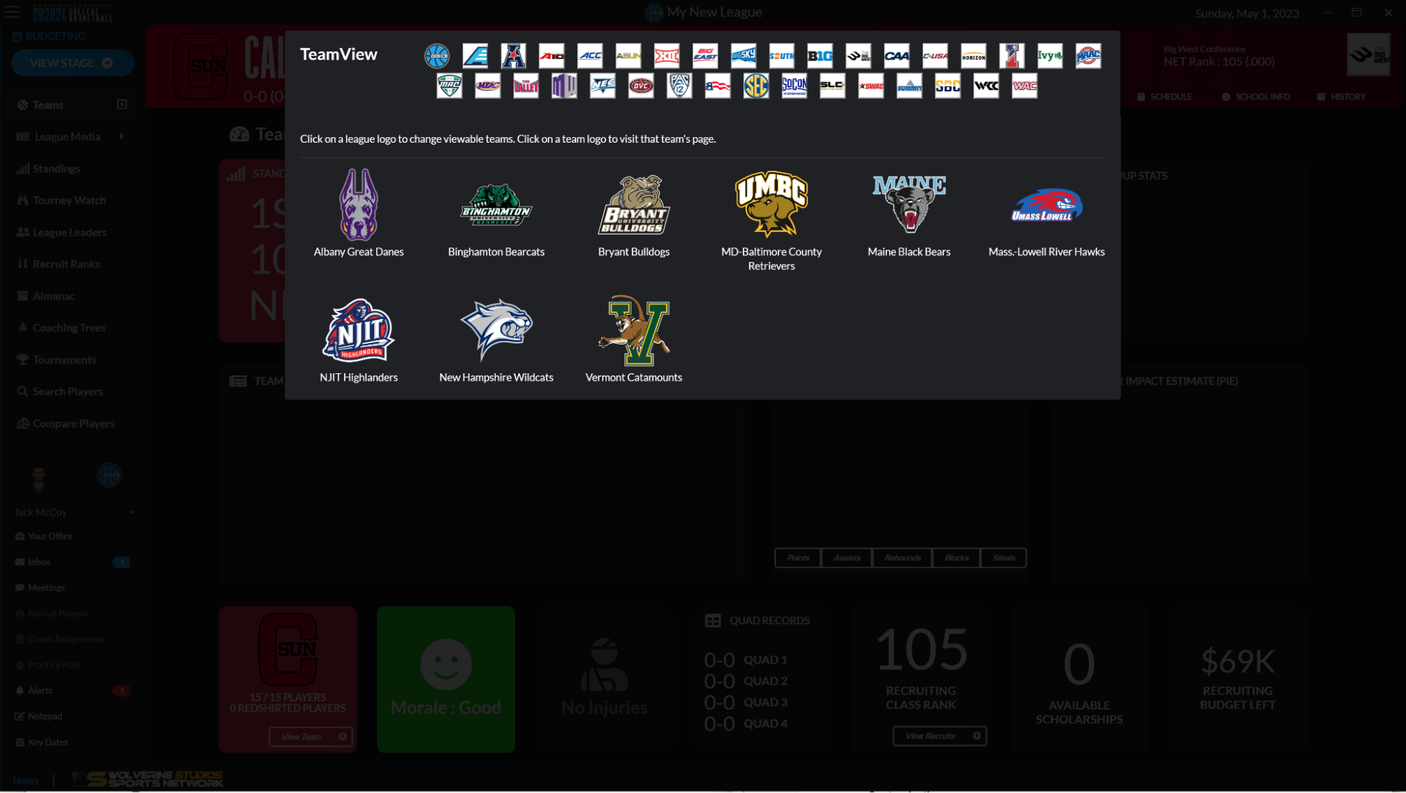
Another thing I immediately like (along with a suggestion): Atop the menu on the left is a Teams button. It will allow you to check in on any team in the league.
This is a FANTASTIC addition and wonderful start, as it was rather cumbersome to get to different teams in the past. I am all about the streamlining of the user experience.
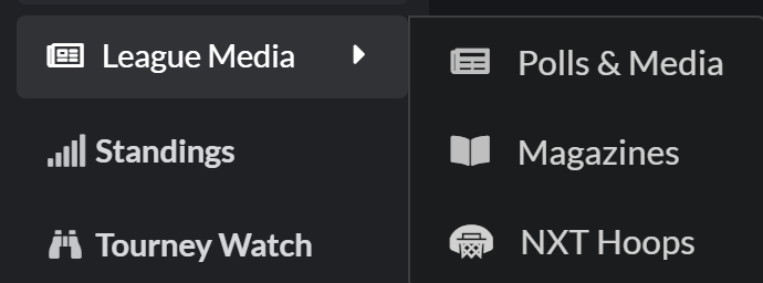
That said, I hope it’s just a start. One change I would make in the future is rooted in streamlining as well. Instead of taking you to a different screen, what not implement what was implemented with the League Media screen?
Having a menu exactly like this, but with conferences and teams, would be amazing. It would also be incredible if Conference Standings got this treatment.
(The dream would be to combine this teams toggle with the conference standings, where you can see the conference standings and select a team from a menu pullout, and not have to leave the home screen at all. But I imagine the UI would not be able to handle that kind of dynamic adjustment needed, as teams would be going up and down those menus. I’m writing this in hopes that Gary sees this and says, “Yeah, that is doable”, then does it.)
As it is, I am quite happy with this Teams screen. I do feel there is room for improvement here. One design decision Wolverine developers make, and this is way more prevalent in the football games than the basketball games…but there is a tendency to fill large areas of the game with either big pictures, or giant boxes of little text. Again, this has been much more of an issue in the football games, where I would redesign every aspect of their news and statistical leaders sections if I had that kind of ability. It’s wildly inefficient to me.
So, to sum up: Yes to the teams screen. Bigger yes to this becoming an ability to select a team or conference from a menu on the home screen. Biggest yes to dynamic menus with real-time standings.
While I am at it…conference homepages would be great. Have standings, conference-specific news, stats leaders, injuries, coach statuses (hot seat), recent results and upcoming schedule, and tournament information, all on one screen. That’s probably overdoing it, but why not shoot for the moon here?
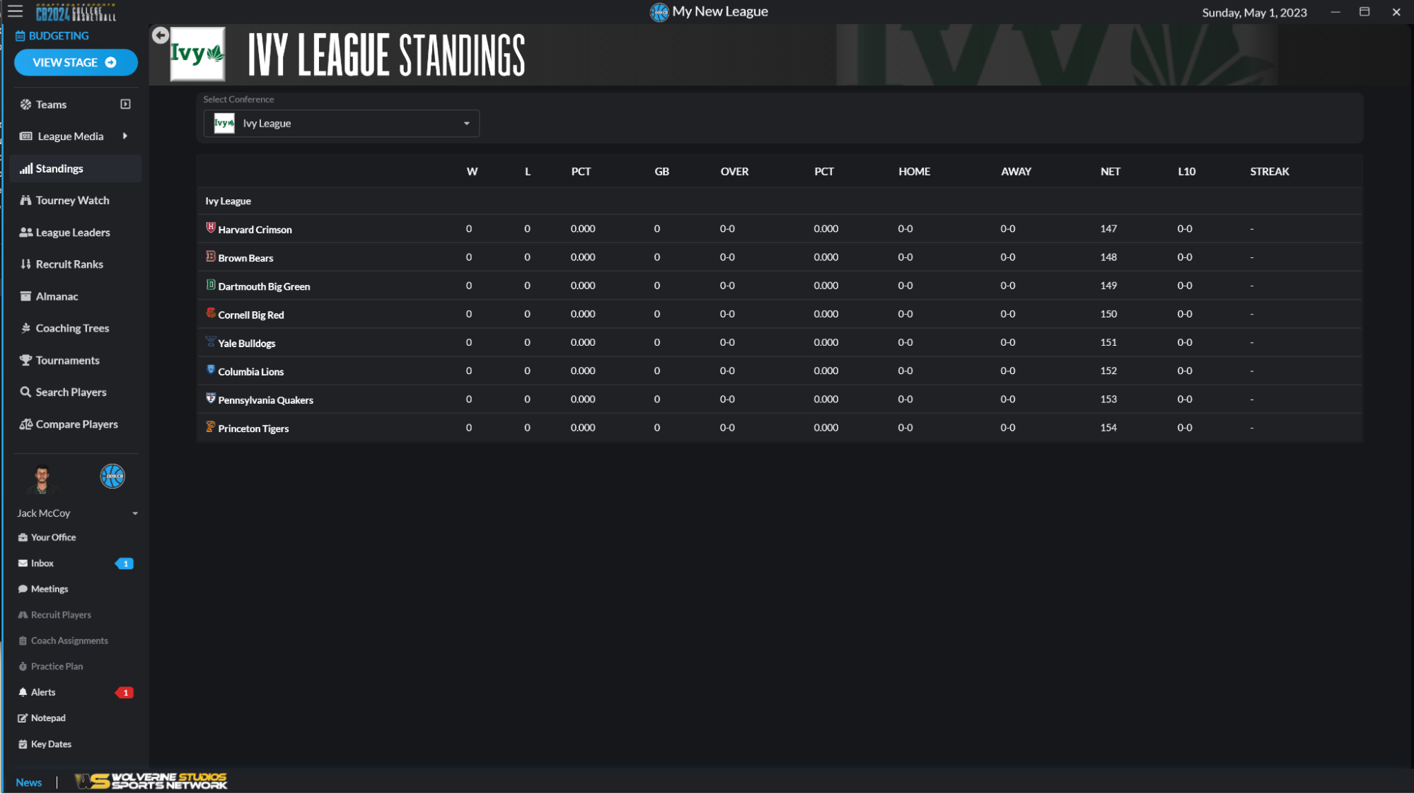
In order to make my point from three paragraphs ago clearer, here is the Ivy League standings screen.
Look at how much unutilized space there is. This screen could be a major player in all Wolverine games. It is a good sign that Gary is willing to redesign some screens–there was a feeling that, once a screen was done, it was locked in forever–but when the game is advertised as having less clicks and more information, this feels like a missed opportunity to really build on that.
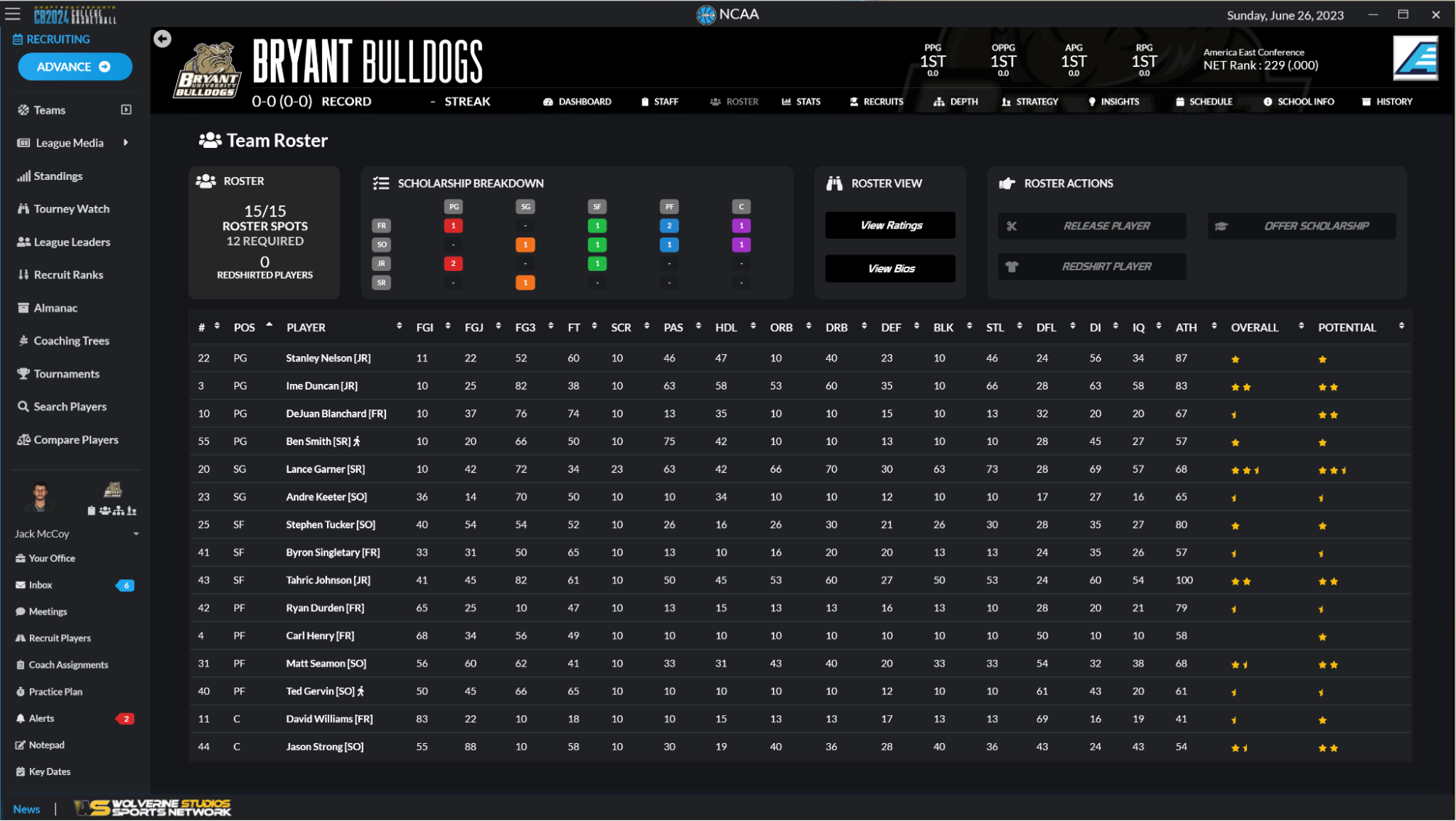
It’s possible that the team roster screen illustrates my point best. I don’t believe this was in the last version, so forgive me if it was. But this really stuck out to me:
 This is very, very useful when figuring out where you need to spend the most time recruiting. Where is this on the roster screen?
The placement is PERFECT. It’s nestled right in. That’s exactly what I want with these other screens. More useful information that fits together. It’s just fanta–
…wait a second. What is that?
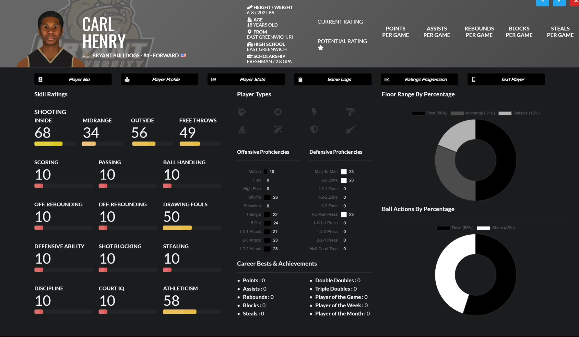
Is that a ZERO-STAR player?
Holy crap. I’ve never seen that before. It’s deserved, I think. But…wow. The accurate disrespect on Carl Henry’s name…I probably should have released him to sign another recruit for next year.
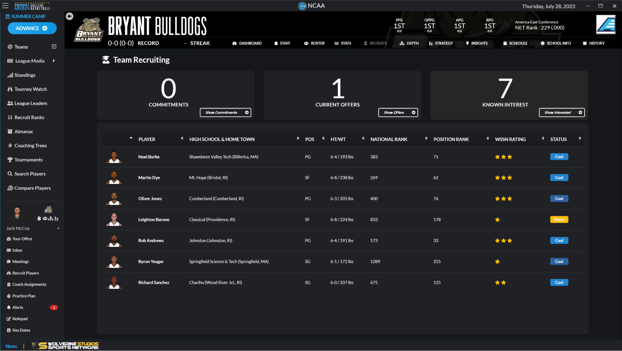
Another area of change I noticed on the Team Dashboard is on the Recruits screen. You can get an overview of your recruiting efforts.
This is a great summary of what you are doing. I absolutely LOVE that you are able to access this screen for ANY team. That is fantastic, especially for dynasty authors or online leagues for creating content. This information used to be hidden, so to see it available is a boon for someone like me, who likes to write a dynasty not just about the team I am running, but the other teams in the conference and region in which my program resides.
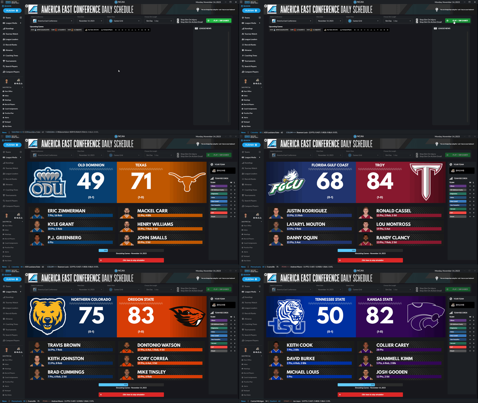
Another very useful, and quite attractive, addition to the interface: The bottom scrollbar.
This is extremely smooth, especially since I’m running this on Parallels. It is also clickable, which is a true joy. I absolutely LOVE this.
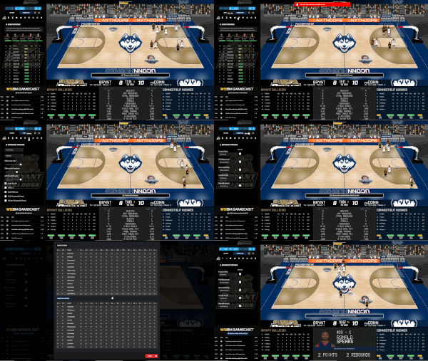
One last major change from last year…and I think this one is the biggest and most useful. The in-game screen has changed…not from a presentation standpoint, but from a functional, game-management one. You can now make adjustments without having to pause the game, or leave the action. You can also check player stats and ratings; they show up in pop-up windows. You can see some of these adjustments in the very long GIF below. Overall, it’s very impressive.
Note: This is the fourth GIF I made of a game that was setting college basketball back fifty years. Google Docs didn’t want to play nicely. So if it feels a bit rushed, that’s why.
The only thing I’m not a fan of here: You now only have two options of game speed: Normal, and Faster. I prefer a much faster speed than what “Faster” is. I like to coach my games, but coach them quickly. So this is an L for me.
Overall, though…big W.
There are other, smaller things I would like to see:
- Ability to text recruits from the general recruiting screen. Saves a click.
- I’ve said this before, but the ability to hover over a player and get basic information.. Saves a click.
Grade: 9.5. The additions made here are excellent. I love the news ticker and how smooth it is. I love the adjustments made to the in-game coaching screen, and how you can make changes on the fly. And I love that the game is heading down a path towards being more streamlined, with more clickable assets at your disposal.
The reason it isn’t a 10 yet is the unused real estate on too many screens. It may be just me; I don’t know. But this game could be an efficiency machine for the user, especially if you make the conference screen a data hub. There is opportunity here to use the UI to really immerse the user into the universe they are in. I sincerely hope it happens in the next version.
Customization
(Author’s Note: I am utilizing Challenge Mode as my example.)
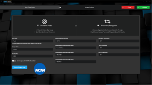
The setup is the same as last year. You have six modes from which to choose. (Tournament Maker is found in the main menu.)
This is not a bad thing. It feels generally inclusive of every way you can play. The only suggestion I would have at this point would be to expand tournament mode, with field sizes going beyond 64. I would suggest fields of 68, 96, 128, 256, and one including every NCAA team be available in the future..This is something I’d love to have in challenge mode as well, just from a fantasy universe standpoint. I do believe expanding these tournaments would benefit the game, however…especially for content creators, who may wish to make imperialism videos.
Once you pick a mode (again, I’m in Challenge Mode), you will have the usual options. I wish there was an option to choose with tournaments you want to run. I know DDSCB is meant to simulate the real world experience. (Though, I would push back…promotion/relegation exists in the game. AND IT SHOULD. It’s fun.) This is just a personal preference; I could point to Fast Break College Basketball, which has this option, but it’s a different game with a different purpose. I use FBCB to run more historical leagues, whereas DDSCB gets the more detailed coaching runs.
I need to note something at this stage, because it is a mistake I make every year. There is an excellent Real World Mod, created by Wolverine forum member NCAAHoops, that is updated for each version. It is available as a full .exe, which is fantastic. This is especially true when you’re running a virtual machine on a Mac to play the game.
This is the mistake I make every year. Well, there are two. And the first one is continually frustrating. Atop your league creation menu is this bar.
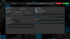
It should be noted that there are TWO screens available here: The Basic Game Setup, and the League Settings. Every single time I fire a new version of this game up, I prematurely hit the green Continue button.
To me, and maybe it’s only me…this area needs a renovation. Even if Gary changes the color scheme to eliminate the variants of gray he has there, or makes for a greater contrast, that would be fine. Heck, I wouldn’t mind if the game forced you into that League Settings screen. It does not, and has not as long as I can remember.
This blends right into the second mistake. If you do not go to the League Settings screen, you cannot activate the Real World Mod into your universe.
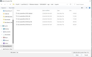
To activate the Real World Mod, you have to click on “Use Custom File”, found in the League Building Options section. Once you click that, you will bring up a window:
From there, you can activate which of the options you wish to use (you can consult the ReadMe for what those options are).
One of the new features of the game is a toggleable option here: Modern Day Transfer Portal. I like that you can toggle it on or off; as someone who prefers legacy teams and players–I typically don’t let players declare for the draft until after three seasons, if at all–I am not sure that I would want to use this in my universe. Of course, for the sake of the review, I’ll be leaving it on. We’ll get to it later.
After that, you can create your coach, which is the same exact thing it has been for several versions now. You create your bio information, your philosophies, skill settings, and select a job.
I know this is a seemingly completed aspect of the game. But, I do have one nitpick. Please expand on the looks a coach can have. I say this as a recently-turned 44-year-old with long hair I didn’t have until the pandemic. There are streaks of gray and white intertwined with my original dark brown. I also have varying degrees of beard, which typically correlates directly to my level of burnout.
I am no longer represented in the game. I say this mostly facetiously. However, as this aspect has not been touched for years…it would be nice for some additional choices.
(One other additional choice that would be great to add: Women.)
Once you put your coach together, you have a variety of jobs from which to select. You can immediately take a head coaching job, or grab an assistant job. The schools you get offers from are directly tied to your initial skill level. For instance, in this universe, if I choose the lowest setting (Rookie), the highest prestige school I will get a HC offer from is 14. These include Longwood, Columbia, Central Connecticut and Sacred Heart.
If I choose Professional, which is the middle ground, the highest prestige school offering me is at 47. These are Arizona State, California, and Utah.
I like that there are staggered options here; you don’t have to go into your coaching career as a complete novice. Of course, if that’s your jam, go for it. I ended up going as a professional, though I adjusted my initial ratings to be a better recruiter than anything else.
For this review, I’ve decided to coach in my backyard, and take over Bryant. They’re a 15 prestige, so I am, in game terms, way overqualified to be here. But I am curious to see how the transfer portal could impact a smaller school like this…especially with my recruiting ability.
One thing to note: Customization is capped at the current number of teams. You can adjust the conferences, but you cannot customize the structure of the postseason tournaments, nor add or subtract teams from your universe. This means you cannot create an 80s-era universe. I asked Gary about this last year; he said that DDSCB is meant to simulate the current college basketball environment. I wish you could create a smaller universe, though you could probably stack a bunch of teams as independents (I don’t know what that would do to the stability of a file), but I understand Gary’s rationale.
Grade: 10. It’s been set for several versions now. The game does what it’s intended to do, which is to create a real-world environment, while offering enough variations of that (yes, pro-rel aside) to keep it fresh. While I will always yearn for the ability to play NCAA as it was, this does exactly the job it is supposed to do, and needs to do. I won’t ding a grade because of what I want, versus what the goal is. That’s just selfish. (This is what I wrote last year; I see no reason to change it.)
Gameplay / Sim Engine
The game drops you off at the beginning of summer, setting you up for recruiting. You do have an option to skip the summer, which is found in email. The game doesn’t draw attention to this option; having an alert or a pop-up at the beginning of your save would be helpful. (I treat in-game emails the way I treat real-life emails…as invitations. I’m a middle-aged introvert; I’m not too keen on invitations to much of anything.)
Before I go any further, there is one thing I want to see added to this game: The ability to select your coaching staff before you go. The game auto-allocates a coaching budget when you begin. It also allocates you coaches. This is what I was given as I took over Bryant, which has a prestige of 15.
This…this is some hot garbage. Even for a low-level prestige team, this is some hot garbage. It would be MUCH better if you are given that budget, hard-coded, at the start of your time, and sent to a couple of rounds of coach hiring. This would still be a difficult process, because low-level teams are likely not to attract too many coaches.
However, this is where things like ambition can come into play. See a young coach with high ambition and some solid skill in a couple of areas? Throw a 1st Assistant offer to them. See someone with a specific skill, like scouting, but not much else? They may be down with a 2nd Assistant role.
Heck, you could add another element here, and give these coaches some homes and built-in pipeline progression stats. Everyone starts off with a completely clean slate, which makes it even more difficult for smaller schools. One could argue that, with everyone at the same spot, any school has a chance to rise up. I counter that you aren’t starting at the same spot, due to prestige and budgets.
Adding this element, or something along these lines, achieves two things:
- Gives every school an opportunity to enhance recruiting in a way it could not before, and
- Makes coaches in the game actually feel useful.
I won’t say they’re totally useless. However…well, you see what I’m handed up above. I guarantee you that wouldn’t be my initial staff. Coaches are generally the most overlooked and underutilized aspect of this game anyway…adding something like this not only gives coaches a actual deeper purpose, but it adds another layer into the universe that doesn’t exist.
To me, this is a necessary mini-game. Come under budget? You get to pour that money into the program. Strike out on your top targets? You may potentially end up with a coaching staff like what we have at Bryant.
I typically reach out to Gary about my reviews when I’m done, and highlight what I am advocating for in future versions. Sometimes, like the daily fantasy game in DDSPB, those land and make it into the game. I hope this is one of those instances, because I really think you can turn an already-existing, nondescript aspect of the game into a feature-packed powerhouse.
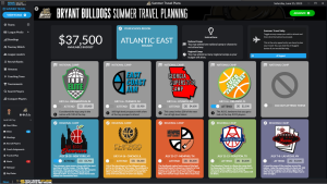
There are some adjustments and additions to the gameplay experience. One place this is immediately noticed: Summer Travel.
The addition of the JuCo Jamboree is a massive win for small schools. This is especially true for a school like Bryant, which sits in the shadow of Providence and URI, and resides in a region that is not exactly a hotbed of high school talent. While I believe my preference would be the transfer portal, beggars can’t be choosers right now.
While I am writing about recruiting (I write my reviews as I play, in case you didn’t know and were wondering, there is a necessary adjustment): It’s time to expand stats. How is it that I have no idea what a recruit from Cumberland High School, a ten-minute drive from Bryant’s campus, shot from three last year? I know there are notes you get from scouts and HS coaches. But if you are at a school like Bryant, with assistant coaches Bryant has (top scout:
)…how am I to trust much of anything they say?
It would be nice, and an added layer of scouting and talent assessment, if we had their shooting statistics. Heck, I’d love for a full line of stats, along with a level of competition faced, like in OOTP. That’s asking too much, I’m sure…but a full line of stats probably is not. I would like the ability to assess a player’s percentages and shot tendencies against what the scouting report says. If a 6’9” power forward is shooting 47% from three, but on .8 attempts a game…are they being underutilized at the high school level, or is this Small Sample Size Theater? As a coach, I would have to weigh my coach assessment, the HS coach assessment (if I had that information), and the statistics…specifically, usage and percentages.
To me, that would be a hell of an added element of strategy to the game, and force a lot more deep-diving on recruits. Last I checked, this game has a lean towards college basketball nerds. I have a feeling adding this dimension would send many of them over the moon.
This isn’t to say that I want the path taken at a small school to be less bumpy. It SHOULD be incredibly difficult and frustrating. I just wish it was those things because of choices you make, not choices that are out of your control.
But, I digress.
One last necessary adjustment I would make: Change the monetary system from a state-based system to proximity-based one. For instance, Bryant is a tiny school in Smithfield, Rhode Island. It is 13 miles to Bellingham, which is in Massachusetts. So why does it cost me $550 to host a kid from Bellingham, which is closer to Bryant than Providence (16 miles)? This is something that kind of breaks the logic and immersion for me, even if I totally understand the limitations of the system.
Overall, I rather do enjoy recruiting, even if it is somewhat monotonous over time. It has been a consistent staple of this series over the years, getting tweaked here and there…but in general, very few changes have been made to this aspect of the game. Generally, that is a good thing. This is even more fun at the small school level, as you have to sift through the lower levels of recruits, looking for diamonds in the rough.
There is one aspect of recruiting that really bothers me, and again, this works against small schools. To illustrate my point, let’s take a look at Michael Brazzle, a small forward out of Bangor, Maine. Here are the basics:
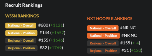
 Here are his recruit rankings:
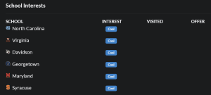
Lastly, here is his interest list:
How does this compute? How does the 155th-ranked player in NEW ENGLAND have ALL of wish-list schools in the ACC or in the DMV? How does that make any sense? I don’t necessarily expect him to be fawning over Bryant, or even remotely interested in them. He refused my invitation for a visit (though, one hack that has made it through in several versions now: If you schedule a visit from the main recruiting screen, instead of on the player page, they tend to accept; it’s not 100%, but it does happen).
However, this does not detract from the fact that he’s a TWO-STAR RECRUIT IN MAINE.
There is one screen I would love to see added to this game, especially as Gary wants to improve efficiency and screen clicks. There are two currently two viewing options: Bio and Ratings. I would love for a Pitches/Interest Rank screen be added. Show where your pitches are, how they’ve landed (color coding would be just fine), and where your school shows up in the recruits’ top ten, if they do. Recruiting does become a clickfest; this would be a solution towards that issue.
It would also be great if you could favorite recruits (yes, I know the call list exists). A simple clickable star or something would suffice.
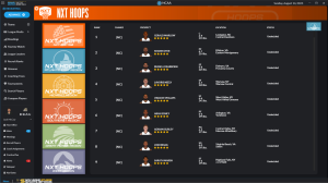
One aspect of recruiting that has changed: NXT Hoops. I (and many others, I am sure) have asked Gary to include a centralized recruiting service for versions now. It makes its way here, which is fantastic.
On this screen, you get the top 150-ranked recruits nationally, and the top 200 for each region. I believe this to be a solid foundation for this particular screen. Where I hope Gary builds on this is two-fold:
1) On the main recruiting screen, please add the NXT rankings next to the WSSN rankings. It would be nice to have them alongside one another, so that you can compare rankings for discrepancies.
2) Add more information to this screen. Give us stats, the interested teams, offers, visits…give us as much as possible here. As pumping the user with information is a priority for this year’s game, this feature, while appreciated, does leave me wanting.
While I am at it, one more thing I would love to see for recruiting: A news hub. I would love to see a weekly recap of who visited what campus, who received offers, who is moving up and down the rankings…all of those things would make recruiting much more immersive than it is now. This isn’t to say recruiting isn’t immersive; however, the user has to do the heavy lifting to become fully immersed.
So…want to save the game from becoming a clickfest? Give us a recruiting news hub.
Okay, I have yammered on and on about recruiting. Said yammering is actually symbolic of the game, though. Recruiting is the biggest aspect of the game, in my opinion. Half of your calendar year is dedicated to recruiting. You have recruiting in-season. Thanks to another addition to the game (which I’ll get to soon), you have recruiting at the end of the season.
But…there is one more thing about recruiting. And this is fantastic.
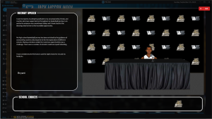
There is now an option to watch your offered recruits make their selections. I had to sweat out this decision for my only scholarship. (You’ll read more about this player in the Fun Factor section.)
Before I get to that last big addition, there is one thing I need to mention: The logic on available jobs for your coach needs to be adjusted towards a more results-based module. I simmed out my season; my Bryant squad went 12-20 (6-10). We got better as the season went on, but we were dreadful.
There are 36 HC vacancies available. The top vacancy available, prestige-wise, is Texas Tech. So I applied for it.
Why the hell did I, a first-year coach sporting a 12-20 career record at a tiny school in Rhode Island, get this job? Bryant was 350th in the NET this season. You mean to tell me the administration at Texas Tech thought THAT performance put me above any other candidate to get their head coaching job?
I got the job because of my ratings. That should be a part, sure. You want ratings to play a role; talent is one piece of it. But your resume matters more, in my opinion…especially when you are young and inexperienced.
The last two big additions to this game happen at the end of the season.
 In previous versions, you had one year-end task: A request to your Board for an upgrade in facilities, an increase in your budget, or more time. You still have that; however, you also have to re-recruit your roster.
The transfer portal, as we know, has blown up in recent years. To me, this is a solid, reasonable method of building a more robust transfer model into the game. Gary has indicated in the past that he didn’t intend to build NIL into the game, though I would welcome it as an option. When it comes to NIL, though, it has to be something the user cannot have any impact on. The coach could request for the Board to build a stronger NIL fund, but that would be it. It would be an interesting wild card to throw in, though, again, I would want it to be an option.
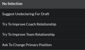
This is a great addition, though, because in previous versions, you didn’t really have this kind of opportunity. I remember being crushed in previous versions when a favorite player would just leave. At least here, I have more of an opportunity, in that I can make one of four pitches to a potential transfer candidate.
The players are clickable, so you can make a more informed decision on these guys. In my case, I made pitches to two of them. The other two…I wouldn’t mind trying my chances in the portal. I received emails from the two I did pitch; they were appreciative, but non-committal. I find that lack of definitive response intriguing.
I had an issue with transfers last year (okay, I’ve had it for several versions now), centered around the lack of information you have at your disposal. There are some changes this year that I appreciate. One thing that did make it into this year’s game is that you keep your recruiting reports, even if a coach leaves. That’s huge, as it was a massive disconnect for me as a player.
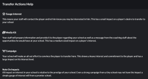
Another is that you have more options at your disposal.
These range from $100 for gauging interest, up to $1000 for a campaign (at least, these are my costs).
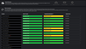
Unfortunately, this is where my appreciation ends. Here is who has me in their Top 5, along with their ratings:
Why do I know NOTHING about these guys? Again, I understand that my coaches haven’t scouted them, and that I can do that now. But why isn’t there a basic scouting service, like OSA in OOTP, that has a basic scouting report on these guys? Why am I going into this blind??? I know I can look at their stats. But I should have more than just this. (And yes, I know this will grow over time.) Even a chance to scout potential candidates towards the end of the season would be great; get an email of potential transfer candidates, then allow your coaches to watch some film on some of them.
As it is, I have to send kits, campaign, potentially even offer scholarships before I have a scouting report? That’s a logical disconnect, and drives me nuts.
Additionally, the email detailing players who have transferred is still terrible. There’s no organization to it on the user side. It’s just a mishmash of names; they aren’t sorted by position or in alphabetical order. There’s no designation of players you showed an interest in or put any money into, either.
Overall, the whole transfer mode in the game still breaks my brain. It’s unfathomable to me that Gary would put additional access to information a priority of the game, and still leave this as it is.
Grade: 9. Look, overall…the gameplay is solid. It has been for a long time. Yes, there are some logic disconnects here and there. Yes, behavior management is a turnoff for me at this point. It’s beyond stale. And yes, I still hate the transfer portal. It sticks out even more now, which makes it worse. It’s the reason this score isn’t higher. However, the in-game coaching and recruiting, which make up the vast majority of the game, are still pretty great. If you want to build a program with an identity, you can absolutely do that here. When that is the main goal of a game, and the game achieves that goal, it’s going to get a high score. Just…ignore transfers.
Online Modes / Multiplayer
When it comes to online leagues, there are really two questions to ask:
- Can you do that?
- If so, is it easy?
The first answer is yes, you can. DDSCB has had online leagues for several versions now.
To the second question…well, I don’t run a league. Chris Valius, the final boss at GMGames, does. We had a discussion about it in last year’s review, which you can check out on your own.
He did, however, tell me that Gary has “some new league customizations around messing with league facility grades, budgets and campus visits”.
First and foremost, I have to say this: When creating my online league file (which is basically the same as creating an offline league), the final step hung at 95%. I had to force quit the game. When I restarted, I tried to load my league…which I did with no issue, it seems.
So that…that was weird. But it seems to work just fine, I think.
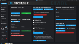
Outside of what Chris indicated to me, the only other notable change, aside from all of the other changes I’ve already discussed, seems to be this:
If a commish were running both a collegiate and pro league, this should be extremely helpful. Honestly, this isn’t something I have done, as the pro game doesn’t overly appeal to me (in general, I mean). But easier linkage between the two does have me thinking about potentially attempting this again, as I really enjoy having a full basketball universe.
Grade: 9. As far as I can tell, file upload reports for the commish are still not a thing. If that has changed, I’ll upgrade this to a 10, as this category is more of a pass/fail to me. It works, people use it, and from what I have seen, it isn’t much of a challenge to do.
Fun Factor
This game is always fun for me, and always offers a unique challenge when I play. Here’s an example from my Bryant experiment:
I don’t typically play as small schools that often. I’m a Big East nerd, and I’m a lifelong UConn fan. I also live in Rhode Island. So I typically play as UConn, though I have had a lot of fun with Providence, too. So I’m not too sure about how to recruit with small schools. I think you should offer early in the process, to ensure you get out in front of potentially bigger schools getting involved. You know, play the whole, “they were the first ones to contact me” card. (I’m pretty sure the game doesn’t reward this, but it’s fun anyway. It would be amazing if the game had added classes here, and you could hook onto a freshman early, watch them blow up, and they somehow stick with you when the time comes.)
So I did this with Bryant. I had one scholarship, and need a 3-and-D guard. I decided to offer PG Rob Andrews, a local kid from Johnston. He’s a 3* guard, ranked 218th in the class. You know, punching above Bryant’s weight. We brought him in on July 9th, so early enough in the process. He had a good visit. But it was clear enough to me that I wasn’t going to get over the hump with him.
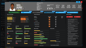
So, I pivoted, revoked the offer, and put it on PG Noel Burke, a 6’4 guard out of Billerca, MA. He’s another 3* (329th). We offered him in late July, after he had a good visit. Again, we’re punching up, but Burke checked all the boxes, and was interested in staying closer to home. Also, nobody atop his list–St. John’s, Old Dominion, or URI–was offering him. He had one other offer, that being from Ohio.
They were also ahead of us. As we got closer to the Contact Period, I got worried. And I started to look around. Should I pivot again? There was another guard in CT, Bill Smith (3*, 274th), who also checked all the boxes. He also had a big showing at the Big Apple Showcase, though that wasn’t translating into offers. He was interested in NC State, VA Commonwealth, WVU and UConn. So I thought, maybe I could sneak in and steal him.
This is where the discussion began. Should I stay on Burke? Could I overcome Ohio? Was it too late to pivot to Smith at this stage? If I was to pivot, shouldn’t it be to a safer choice, like a few of the 2* guys who looked pretty decent? There was a 6’8 forward, James Finneman out of Maine (2*, 545th), who looked like a hell of a steal.
Once we got to the Contact Period, I visited four players: Burke, Smith, Finneman, and Richard Sanchez, a local 2* kid who had us atop his list. He looked pretty decent, though he was a poor passer for a guard, and his stats, outside of scoring, were quite minimal. I decided my plan would be to stick with Burke and evaluate the visits.
The result:
Sanchez: Over the moon.
Finneman: Very pleased with the visit.
Burke: Loved the visit.
Smith: Meh.
Burke didn’t make his decision after the first week, which forced another decision out of me. Do I go back for another visit? Or do I wait it out? It did show us as getting ahead of Ohio…so I decided to go back one more time.
You know…let that 85 recruiting charisma work for me.
The end result?
I’m pretty happy about this. It also shows that you can succeed at really small schools with higher-mid recruits. (Though, there was a rerank after I wrote this: Burke dropped down to a 2*, at 464th overall. Rob Andrews, the kid from Johnston, moved up to 4*, 124th overall; he’ll be attending Iona. I like Burke’s makeup more, honestly. Later in the season, he swung back to a 3*. I like that the list varies throughout the season.)
(Also, after I discovered the kid with no stars on my roster, I went and cut him. I ultimately signed the Sanchez kid, whose stats improved as the season went on…I think.)
By the way, that Brazzle kid I mentioned earlier, the 2* who is interested in UNC, Wake, Georgetown, etc…he’s only had one visit so far, which is to Boston College. No offers. He didn’t sign with anyone, and is not a walk-on anywhere.
It is easy to get immersed into this game. The universe created is rich, deep, and full of information and personality. While there are some quirks I would like to see an overhaul on–dealing with player behavior is easily atop that list–it is a game that is easy to pick up and play, though difficult to master.
It’s also a game you won’t play the same way twice. That’s arguably the best thing you could say about a sports game, isn’t it? It isn’t predictable, and there are many ways to find success, often within the same program.
Grade: 9.5. It feels unfair to ding two categories because of one thing. The transfer issue is enough to do that here. If Gary can overhaul that and make it more in-line with recruiting, then it’s a 10, easy. As it is, it’s close.
The Final Word: Draft Day Sports: College Basketball 24 hits with its additions in recruiting, and absolutely with its improvements to the in-game coaching screen. Having more information available to you is important in a game where you are generally blind to how players actually play. Gary Gorski and company need to continue to build on those information additions; I would much rather have too much information than not enough. But if Wolverine Studios can continue to use information to build that third dimension–adding more recruiting stats, again, is a big one–then this game should take The Leap.
That is something I have been waiting for this game to make for a few versions now. Fortunately, the steps taken with DDSCB24 give me hope that The Leap may be made with the next version.
Just…fix transfers. Please. Fix it.
Official Download for Draft Day Sports: College Basketball 2024
Leave a comment for John or GM Games on reddit…
(9.4 / 10) Draft Day Sports College Basketball 24 Review. It isn’t predictable, and there are many ways to find success.
byu/cv81 ingmgames
